
As part of my packages, I offer my clients a number of photos that they can choose to color correct and choose to retouch. Color correction and retouching are two different forms of editing. Each involves more in-depth steps. This article explains the differences between the two and breaks down each one in detail!
Color Correction
Although a lot of people may already know what colour correction involves, I decided to break it down and show examples to make it easier to understand.
When it comes to color-corrected photos, I usually use presets that I have either bought or made on my own. Presets are one-click edits. They are similar to “filters”, however, they work with RAW high-quality photos and can adjust things like brightness, shadows, lights, clarity, saturation, vibrance and more. Don’t mistake this for being lazy at editing. I give my clients on average 80 photos, if I was to edit these by hand, it would take minimum 5 hours. When I choose these presets, I have to consider the conditions of where the photo was taken. Was it indoor or outdoor, was it sunny or cloudy? Did I use studio lighting? What outfits were worn, is this for a boudoir or a family shoot? All these things affect my decisions. And even after selecting a preset, there are always slight adjustments I have to make.
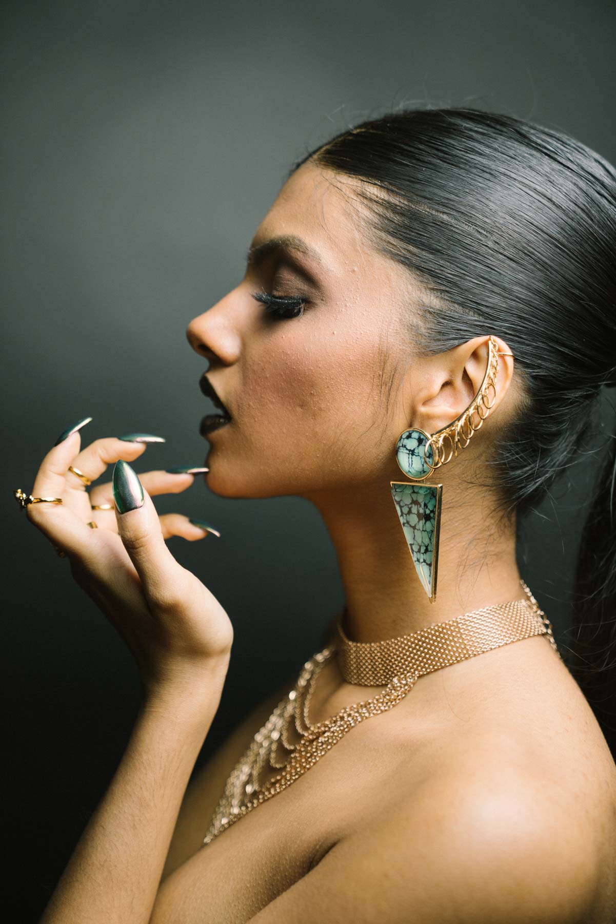
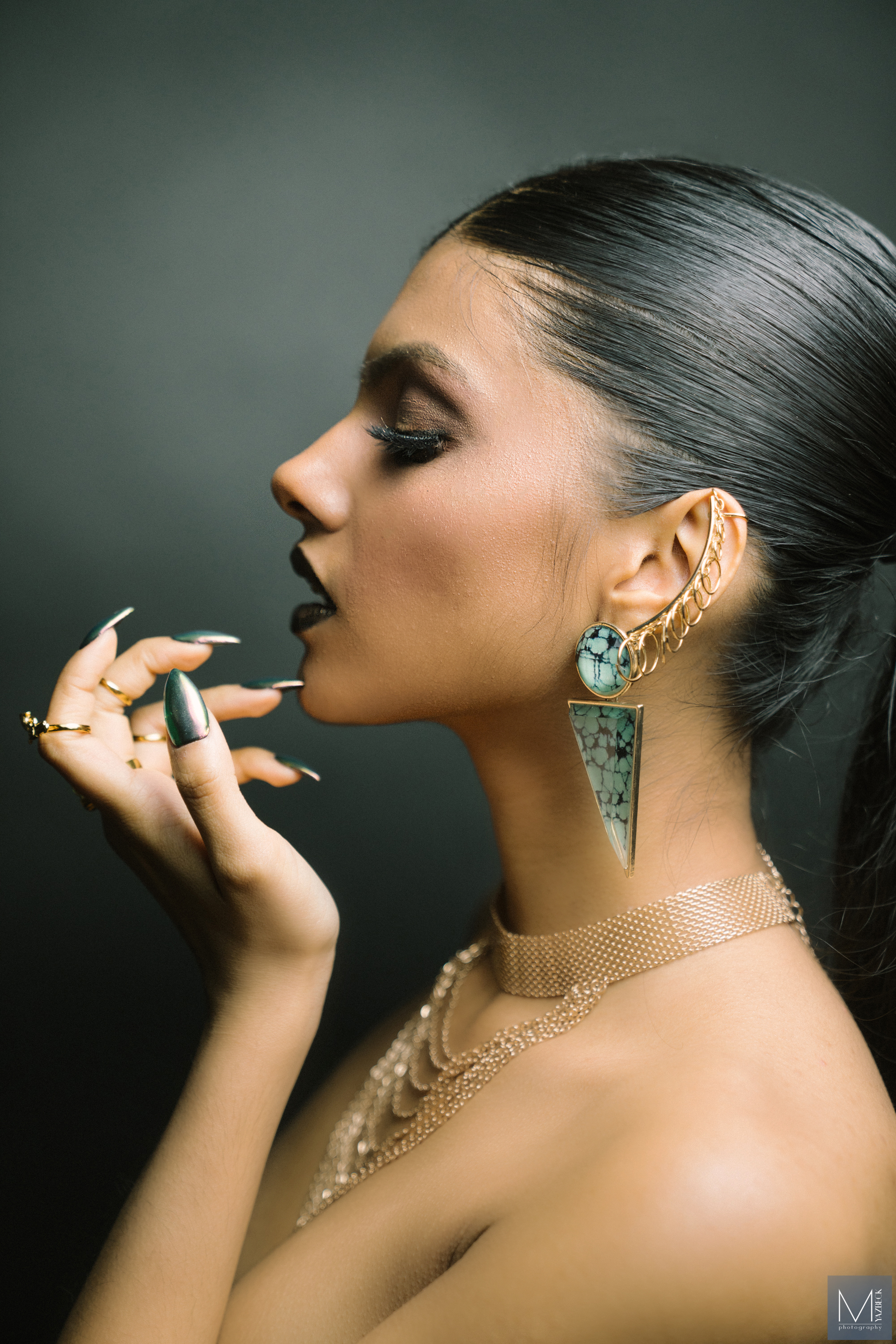
When I give my clients their photos, I love to edit them differently unless they specifically ask for one certain style of photos. My main editing styles usually fall under the following categories:
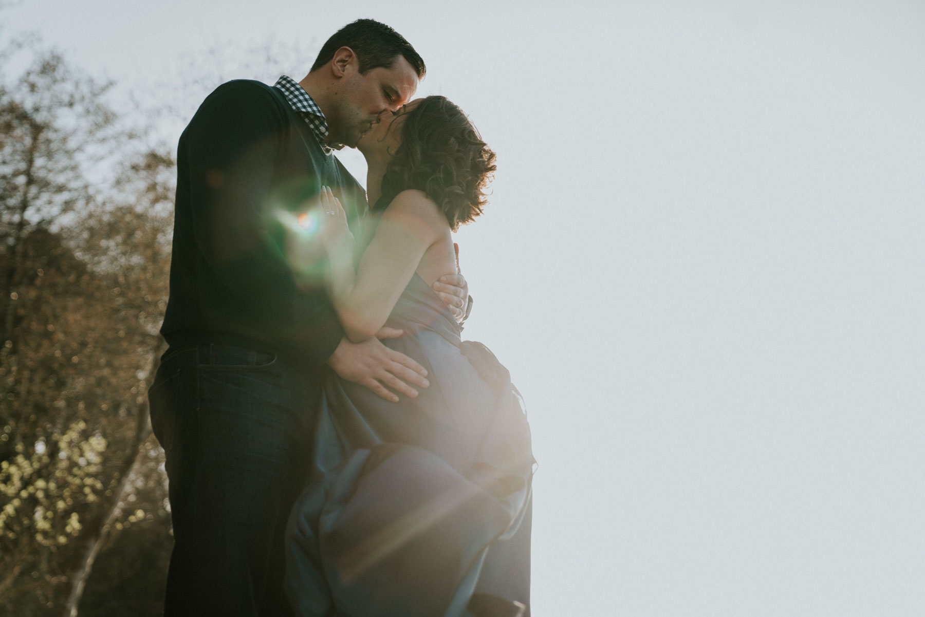
Warm Tones
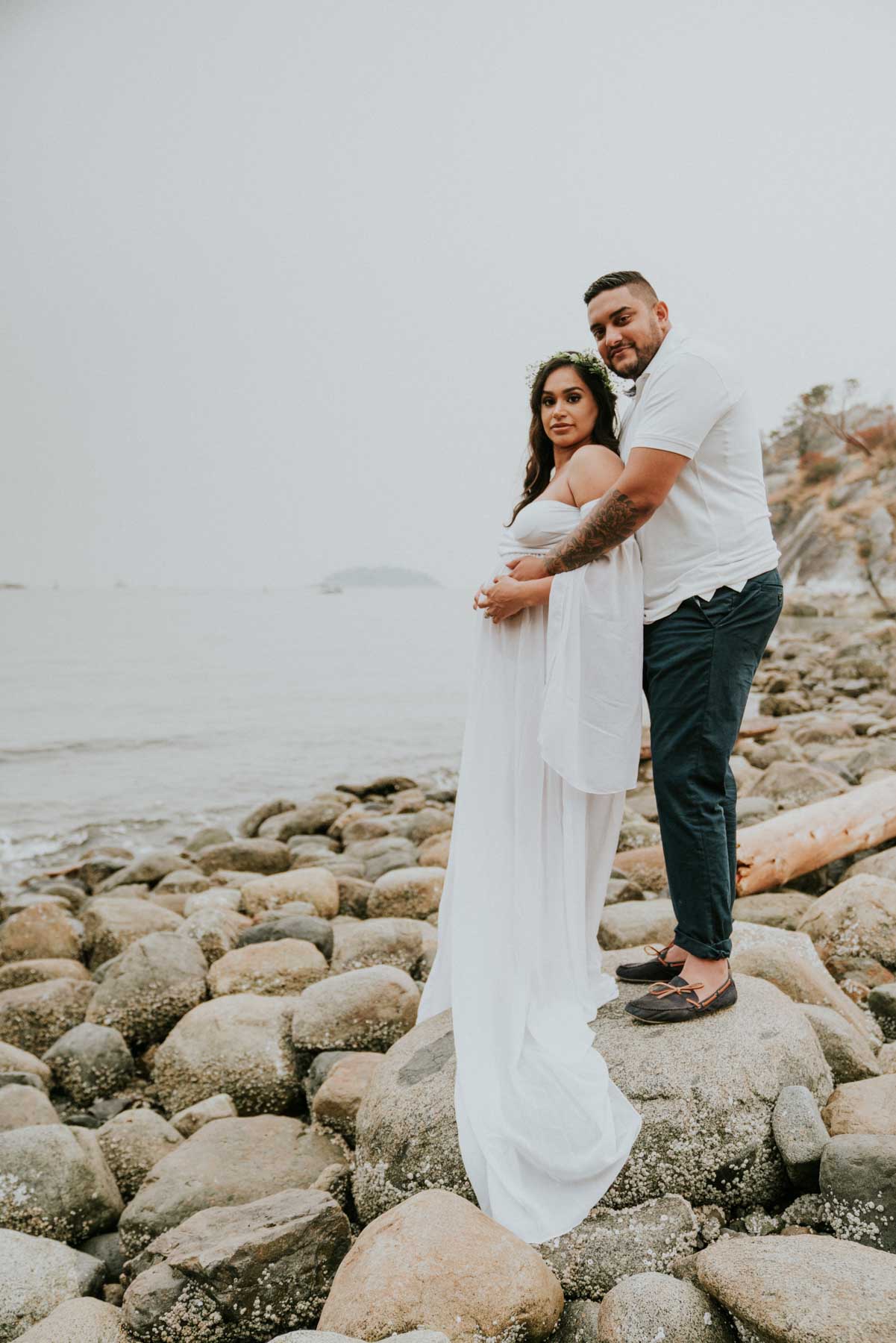
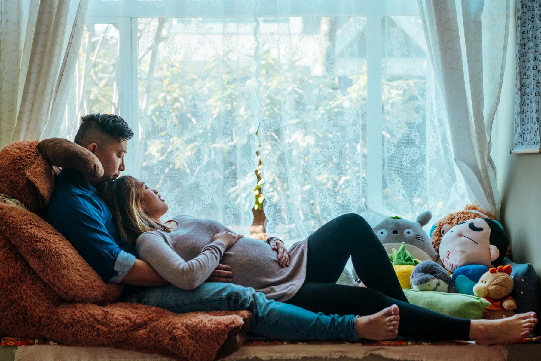
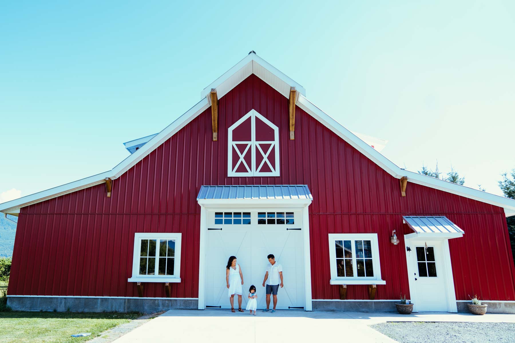
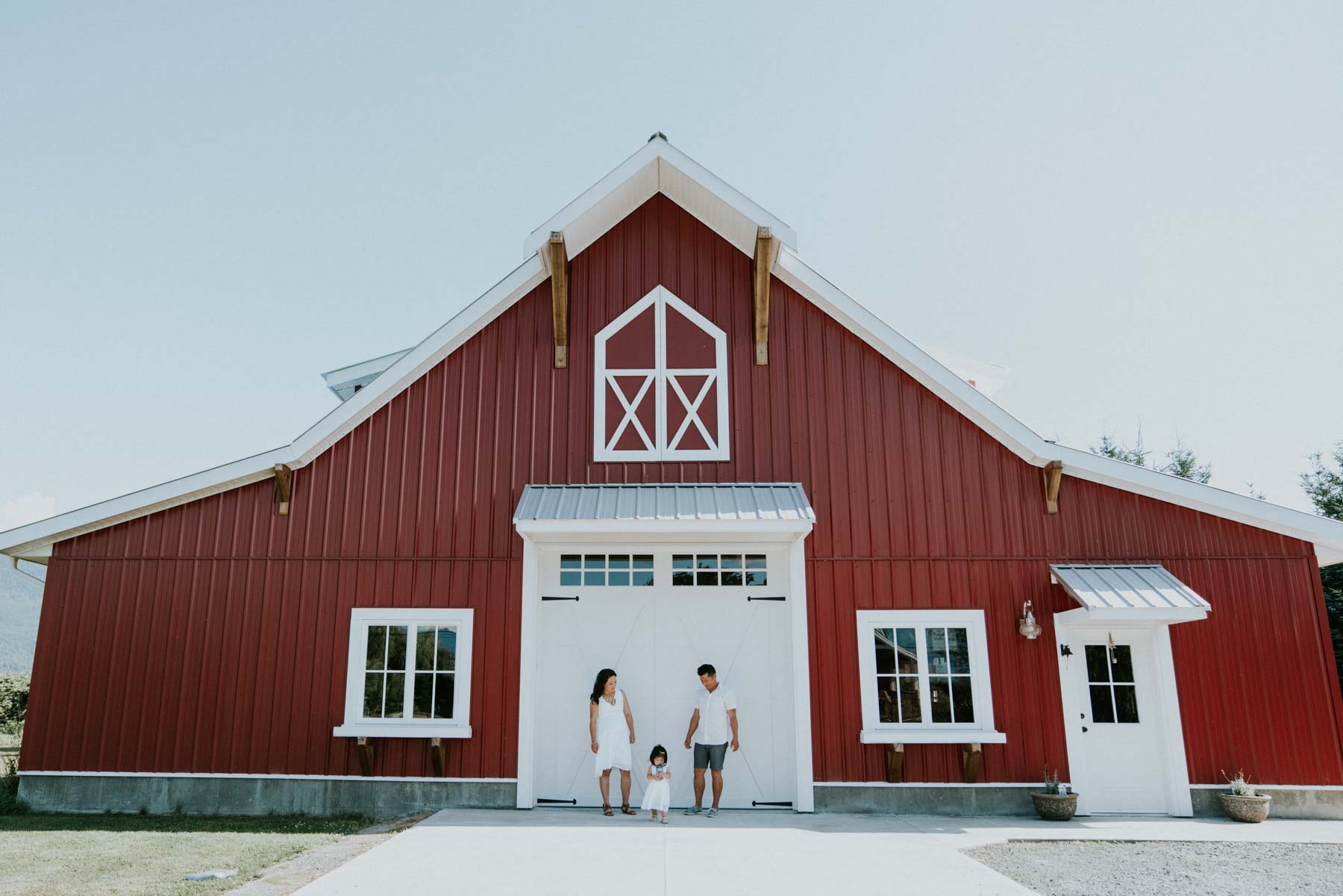
This type of style is used by many photographers in the Pacific North West. They are usually filled with “earthy” tones & tints. Bringing out the yellows, and browns. The style is great for outdoor photos in fields. The style is more desaturated. Here are a few photos using warm presets.
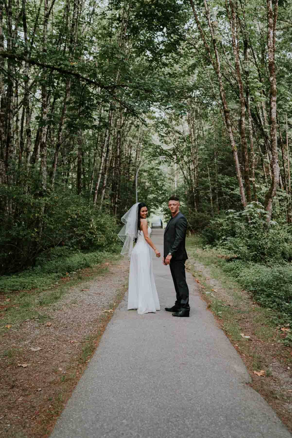
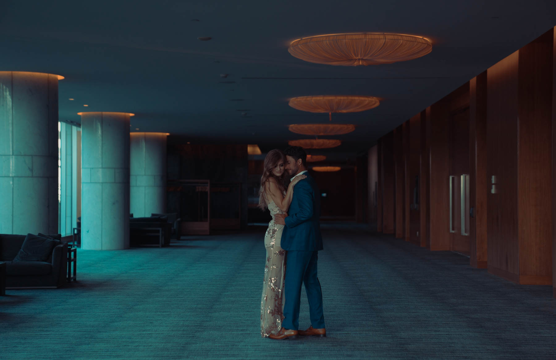
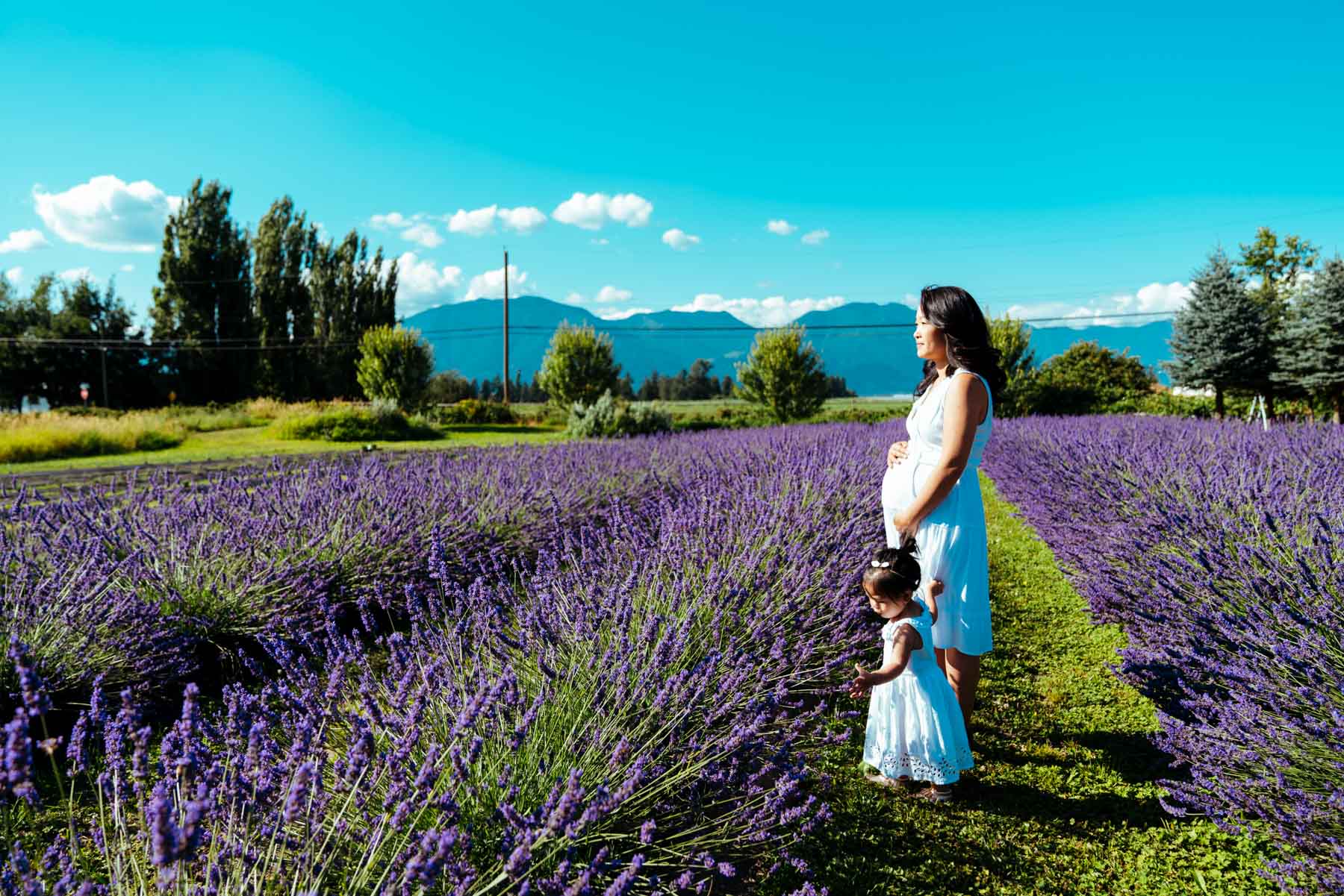
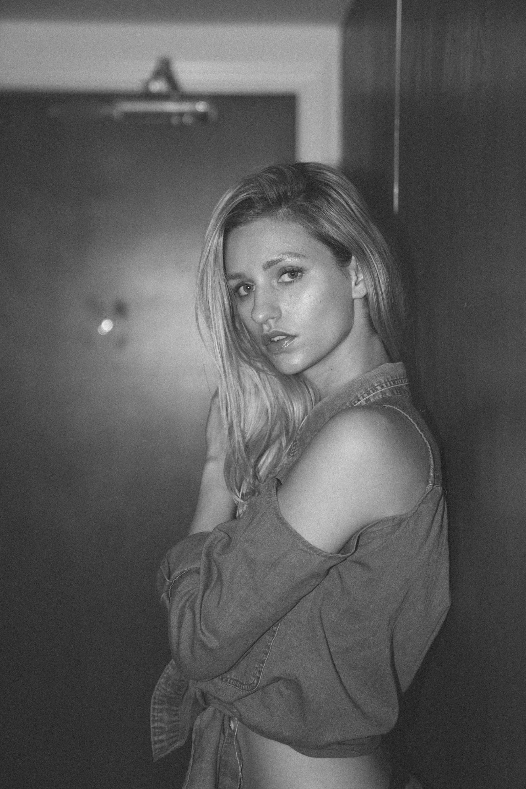
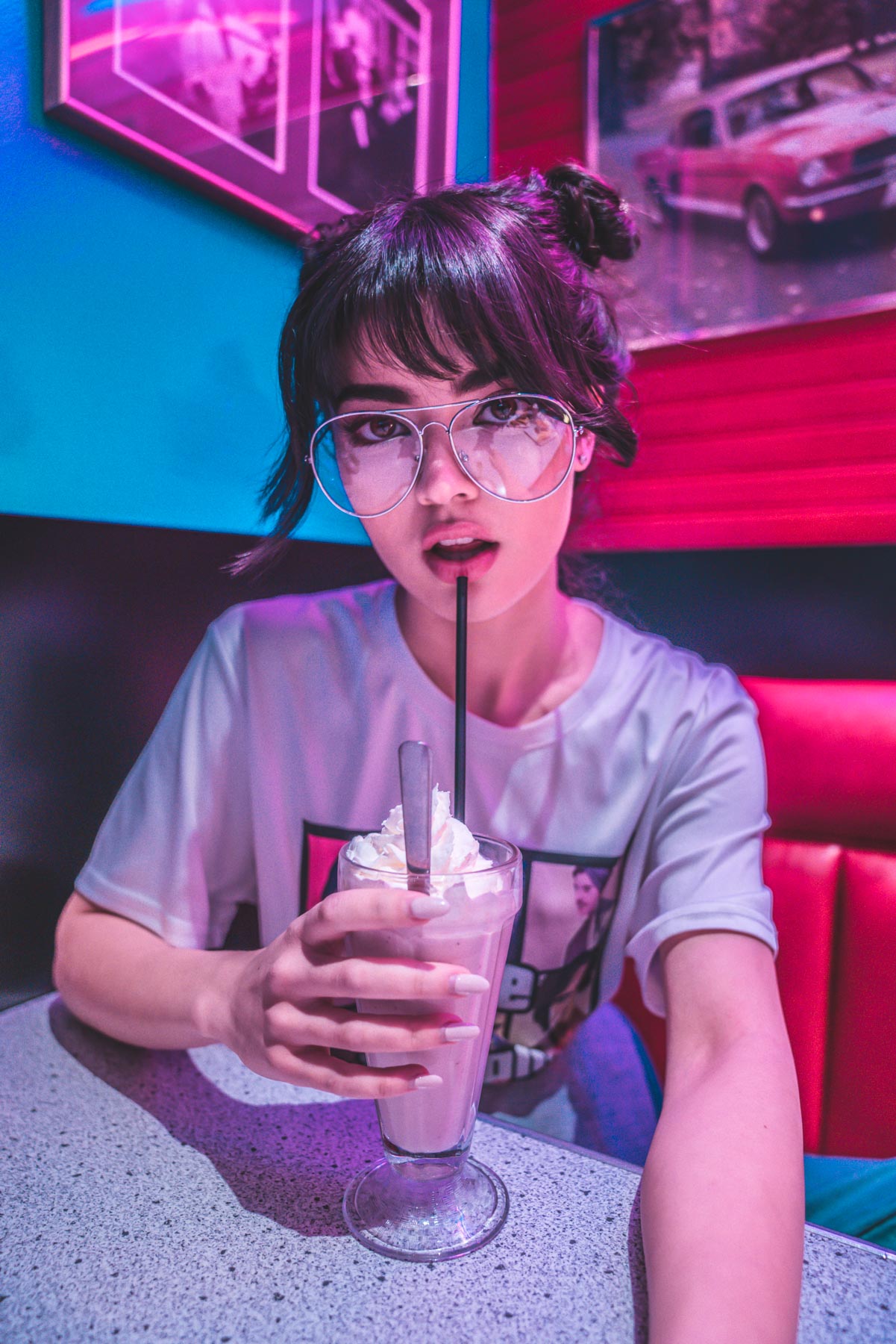
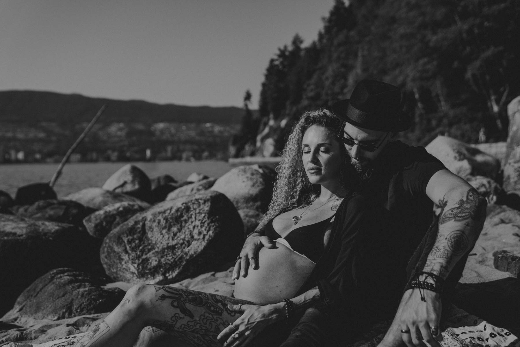
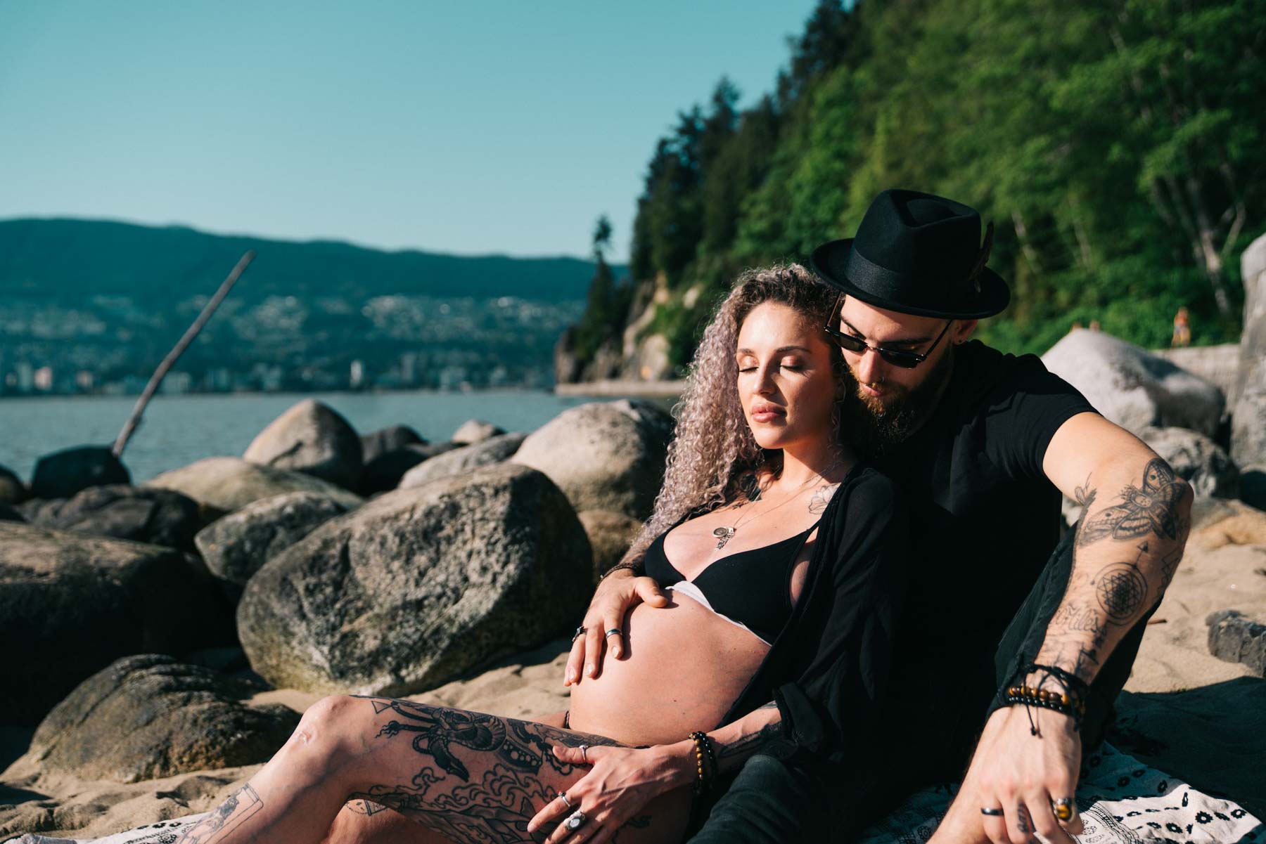
Cold Tones
This style is also more desaturated and less vibrant however the temperature of the photos is colder. This style is great for monotone and symmetrical photos. They are also great for clean, indoor shots when you are wearing whites, and blues.
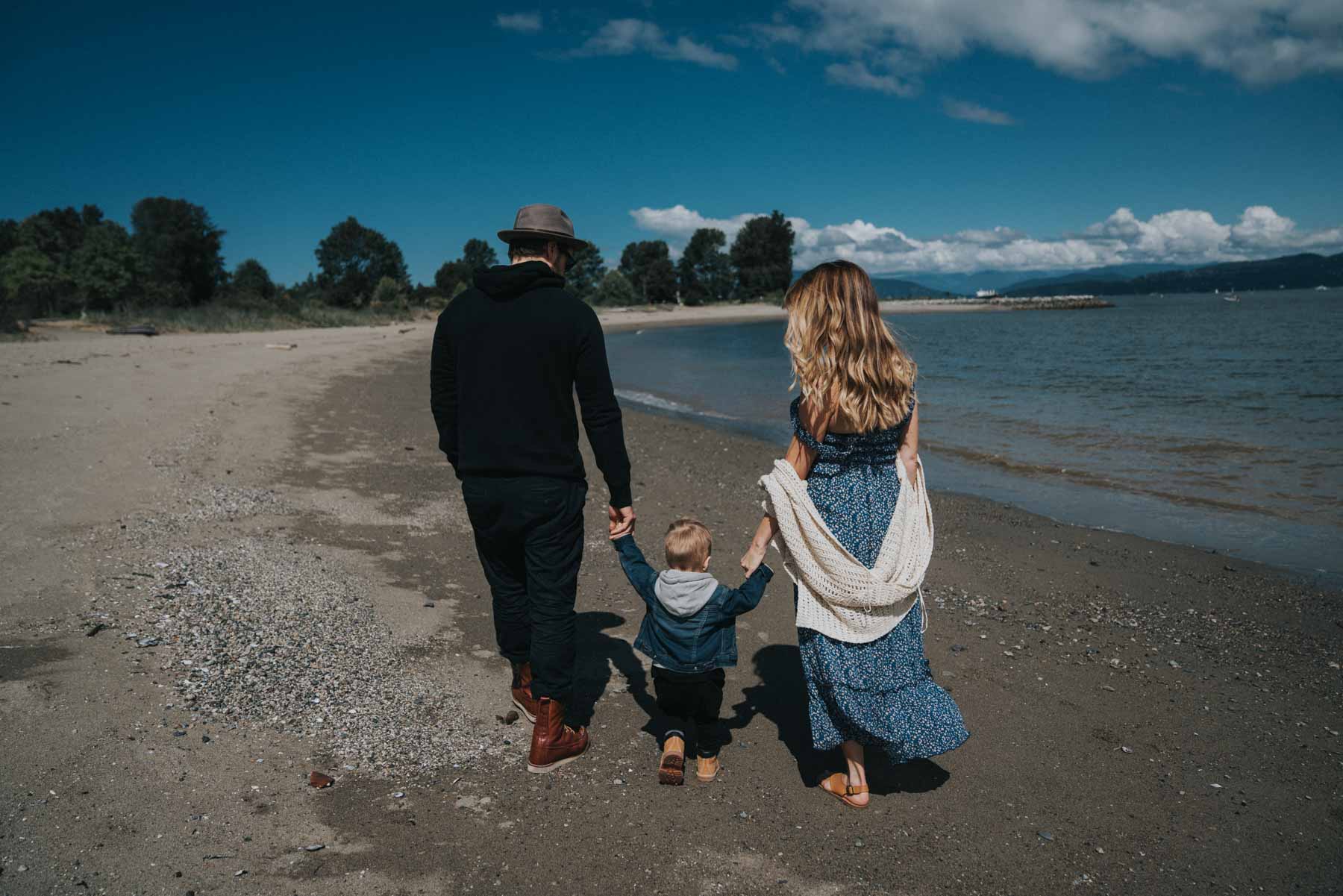
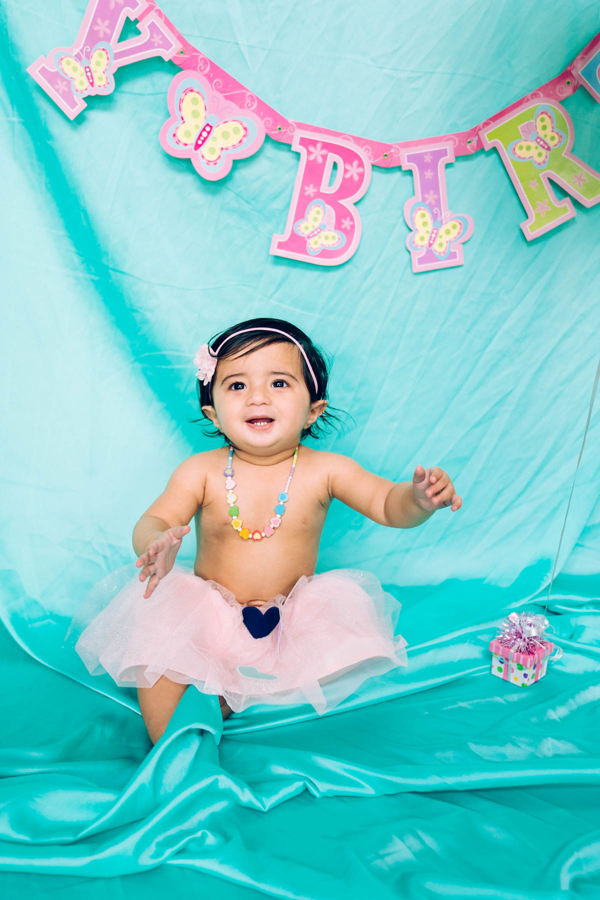
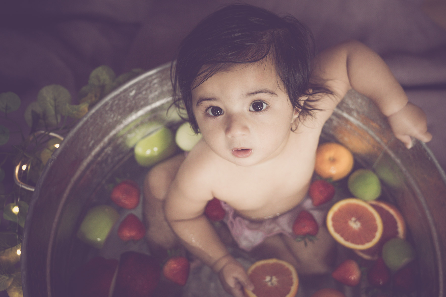
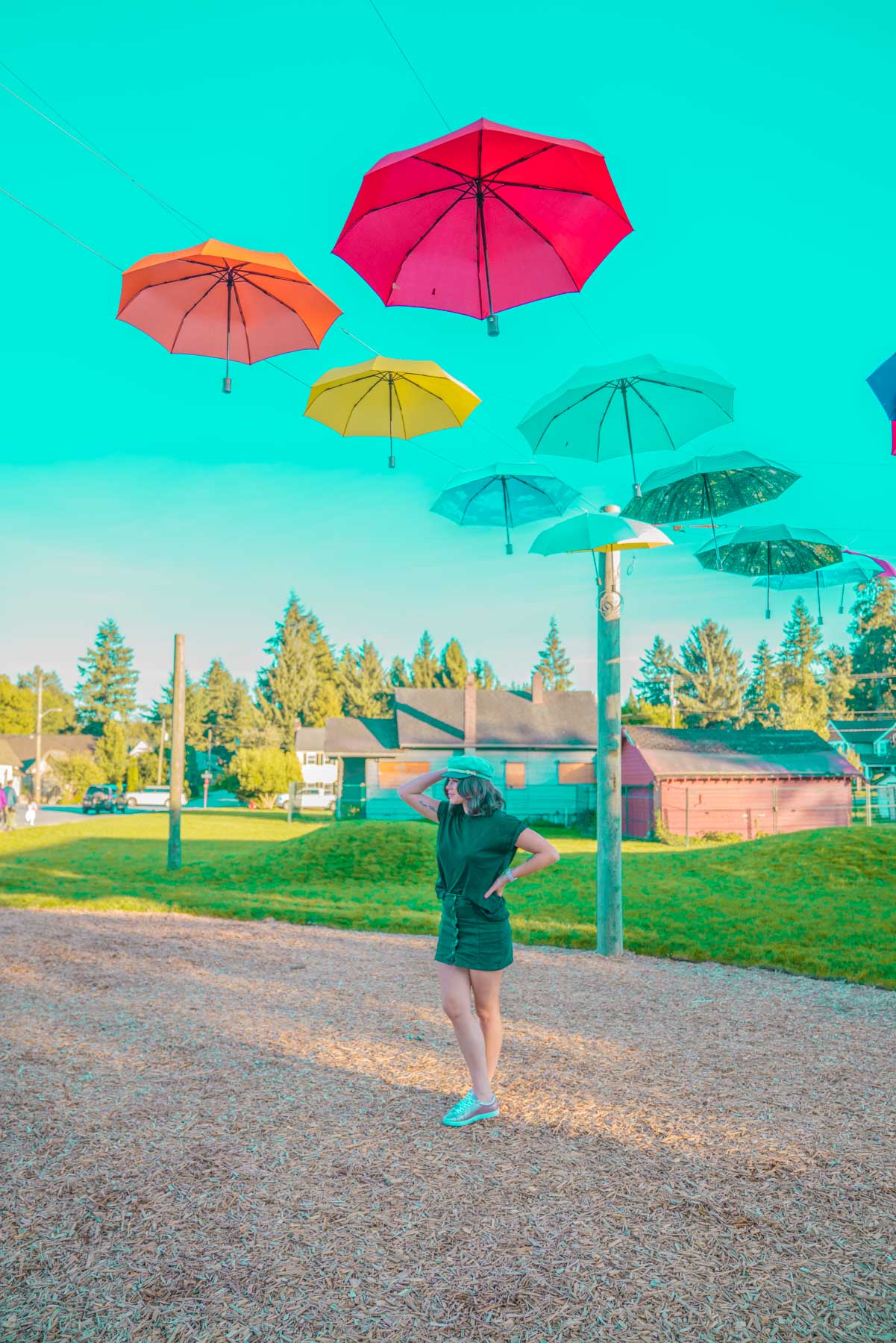
Saturated & Vibrant
This is pretty straight forward, this style is colourful and vibrant.
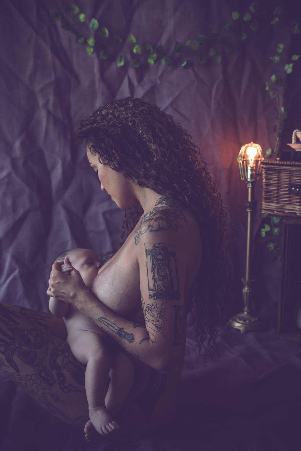
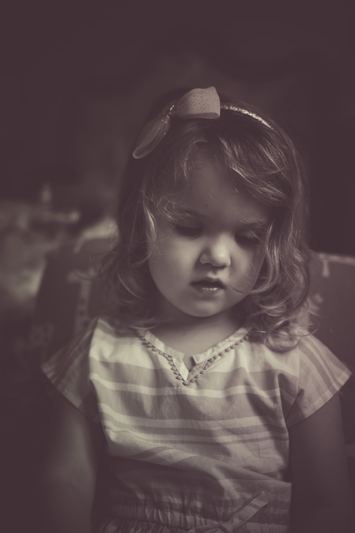
Vintage
This style brings you to dream like photos. They are meant to be story telling, and fairy like. As if you are looking at a painting.
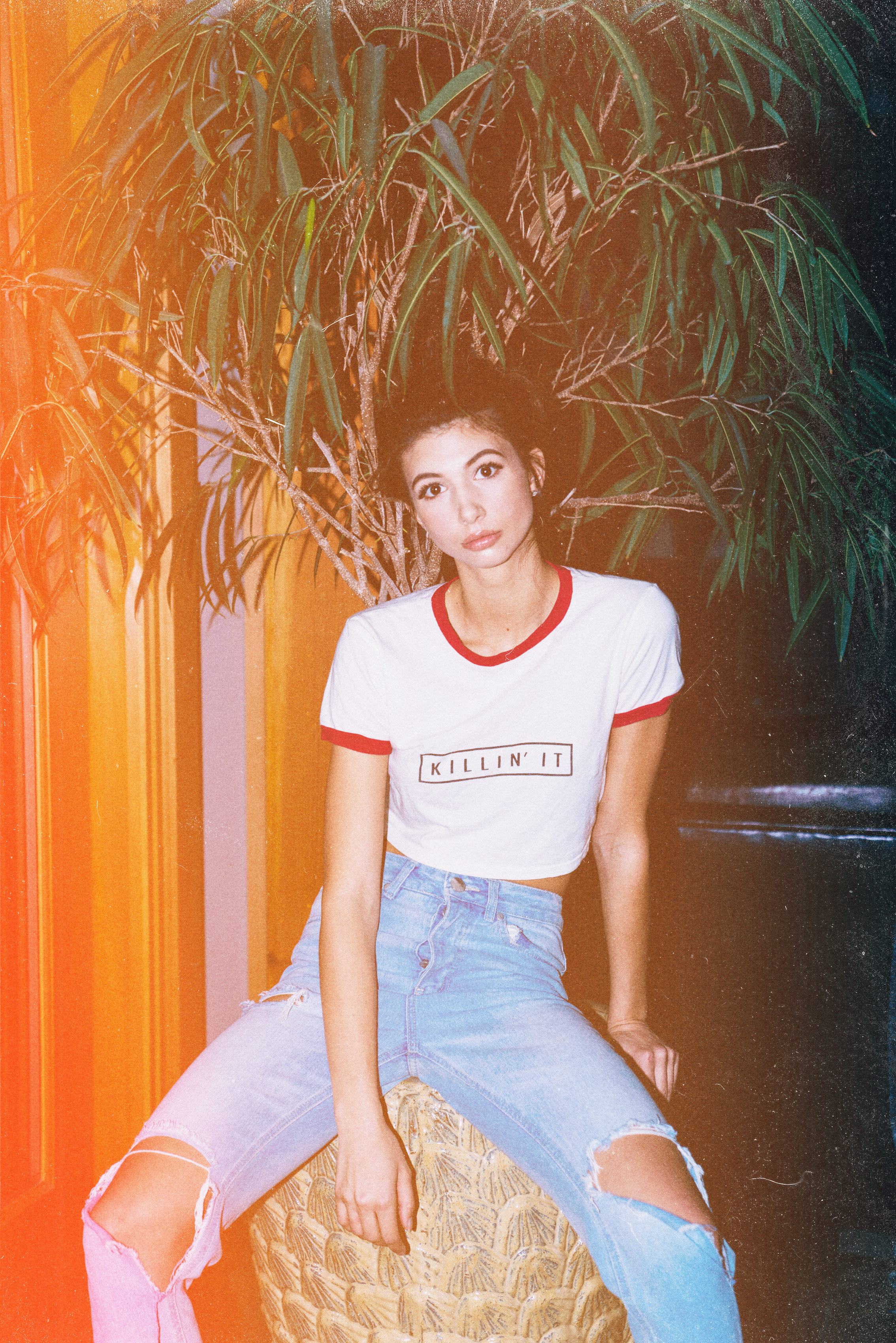
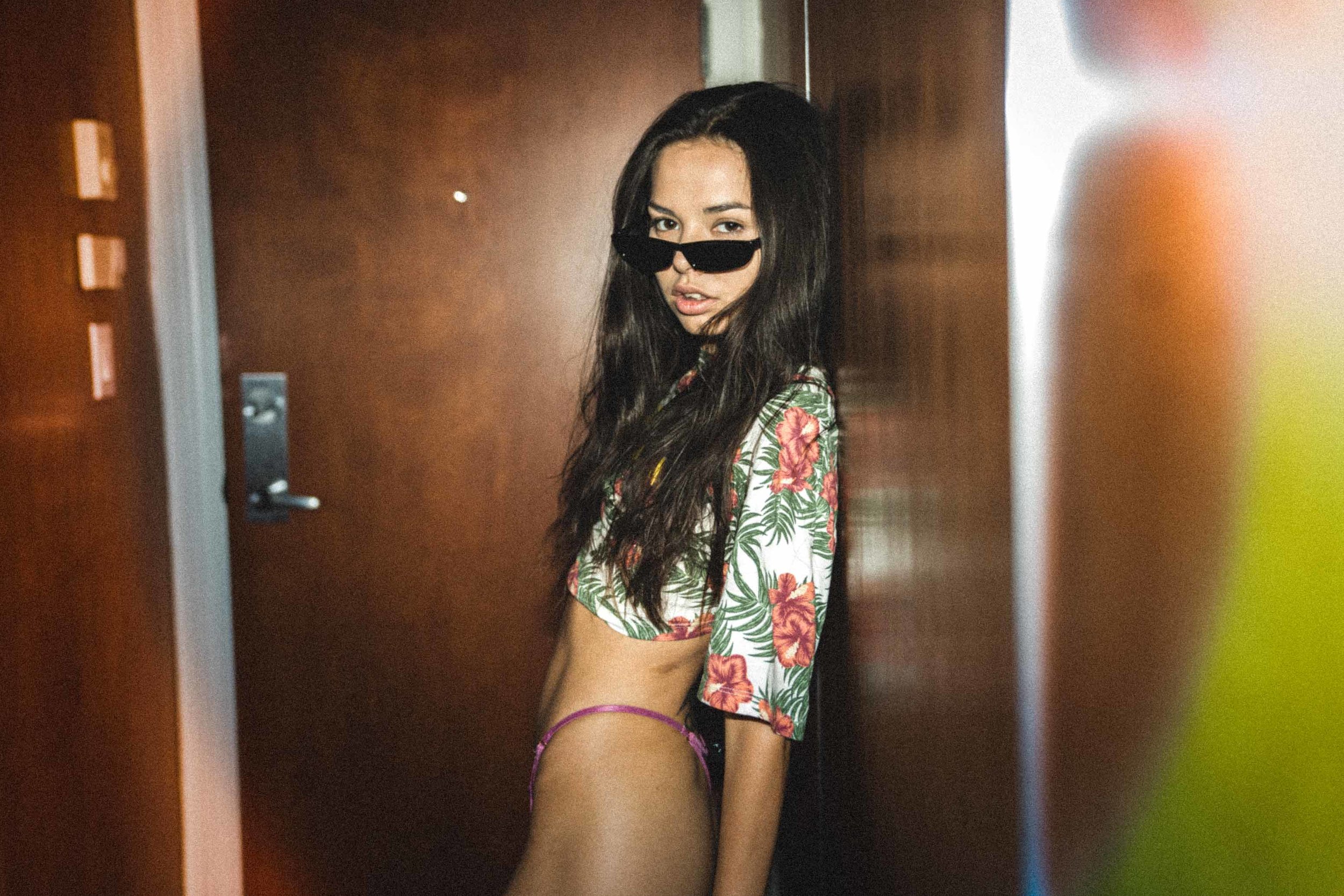
Retro
Retro tries to replicate film. Think lots of grain, light leaks and damaged film. Out of focus, and blurry photos.
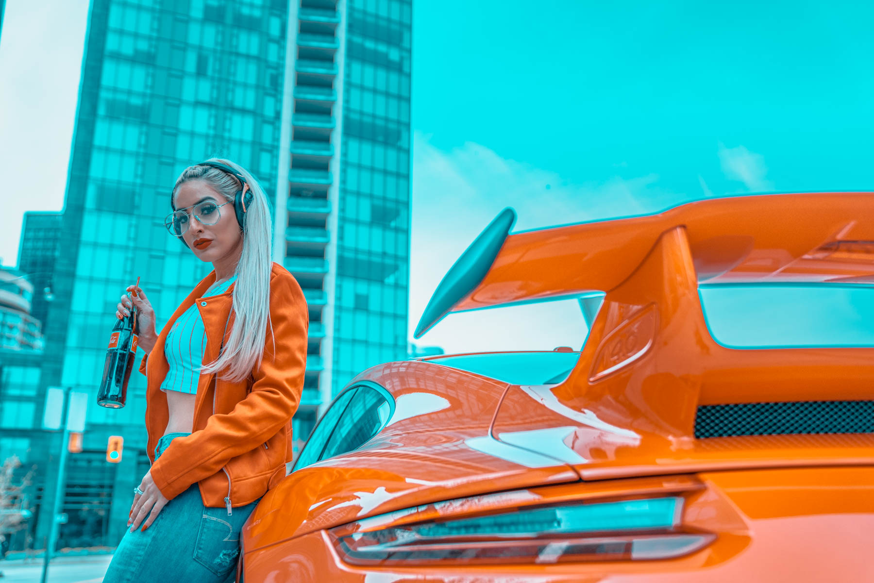
Hyper Realistic/Futurastic
This one is a fun one. Think video game, and flying cars. This style is very saturated and is meant to look unrealistic.
Now going back to the color correction, each photo I give to my clients, they have a choice of changing things like:
Brightness. +/-
Making a photo less or more bright. Sometimes making a photo brighter can cause “grain” because there was just not enough light during the shoot, and a high ISO was already used. So making a photo brighter can cause the photo to lose its quality. They are ways to compensate for that, for example you could up your luminance, and make sure your sharpening is lowered.
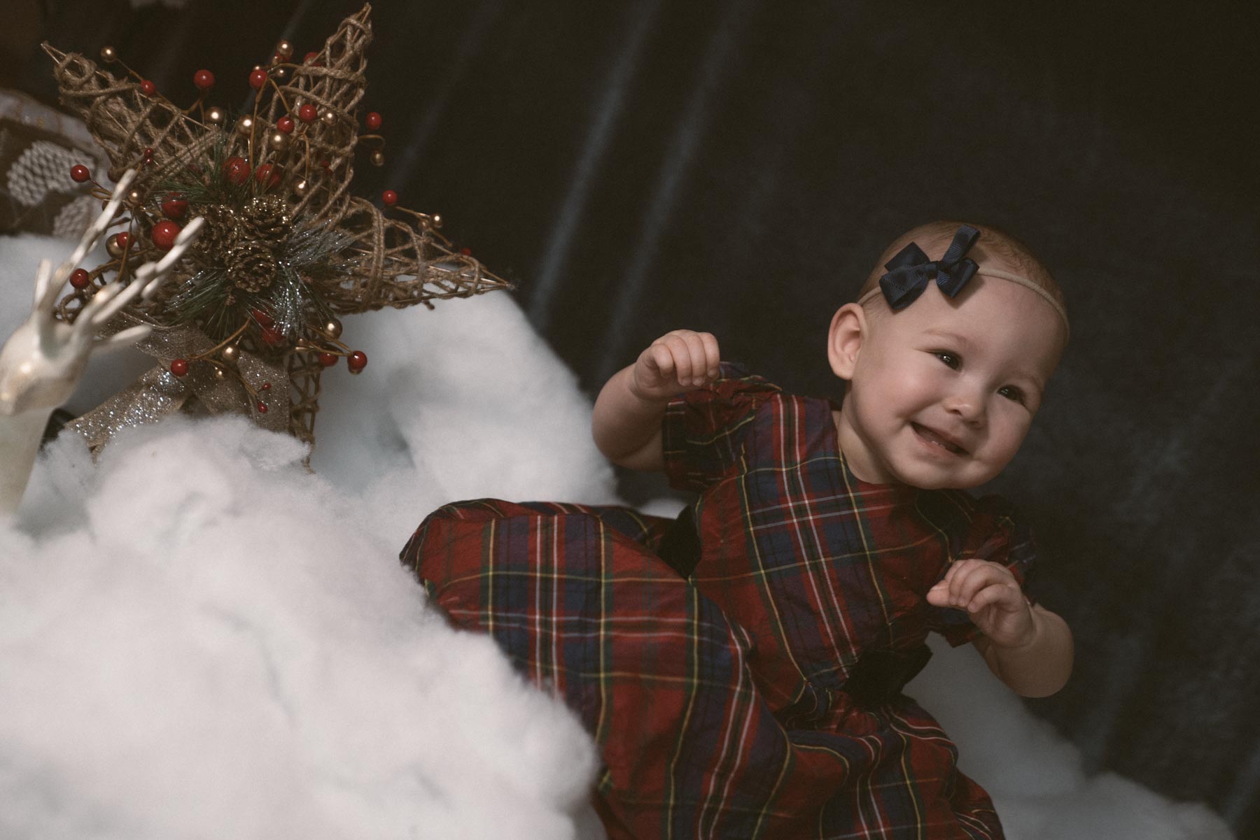
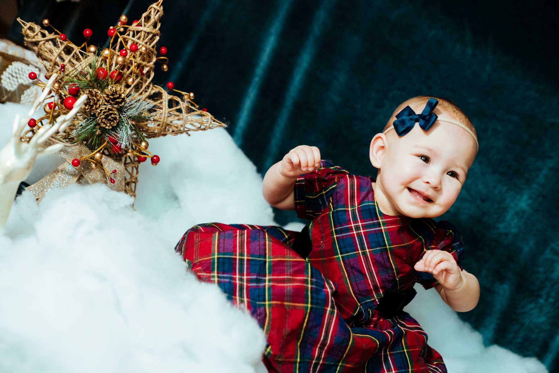
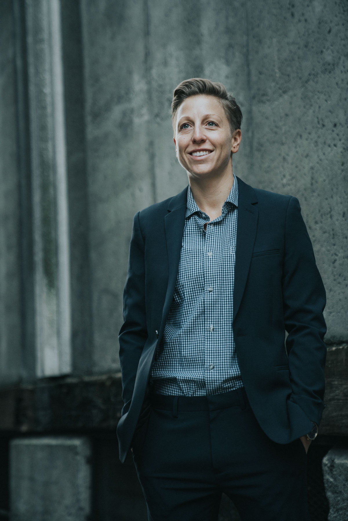
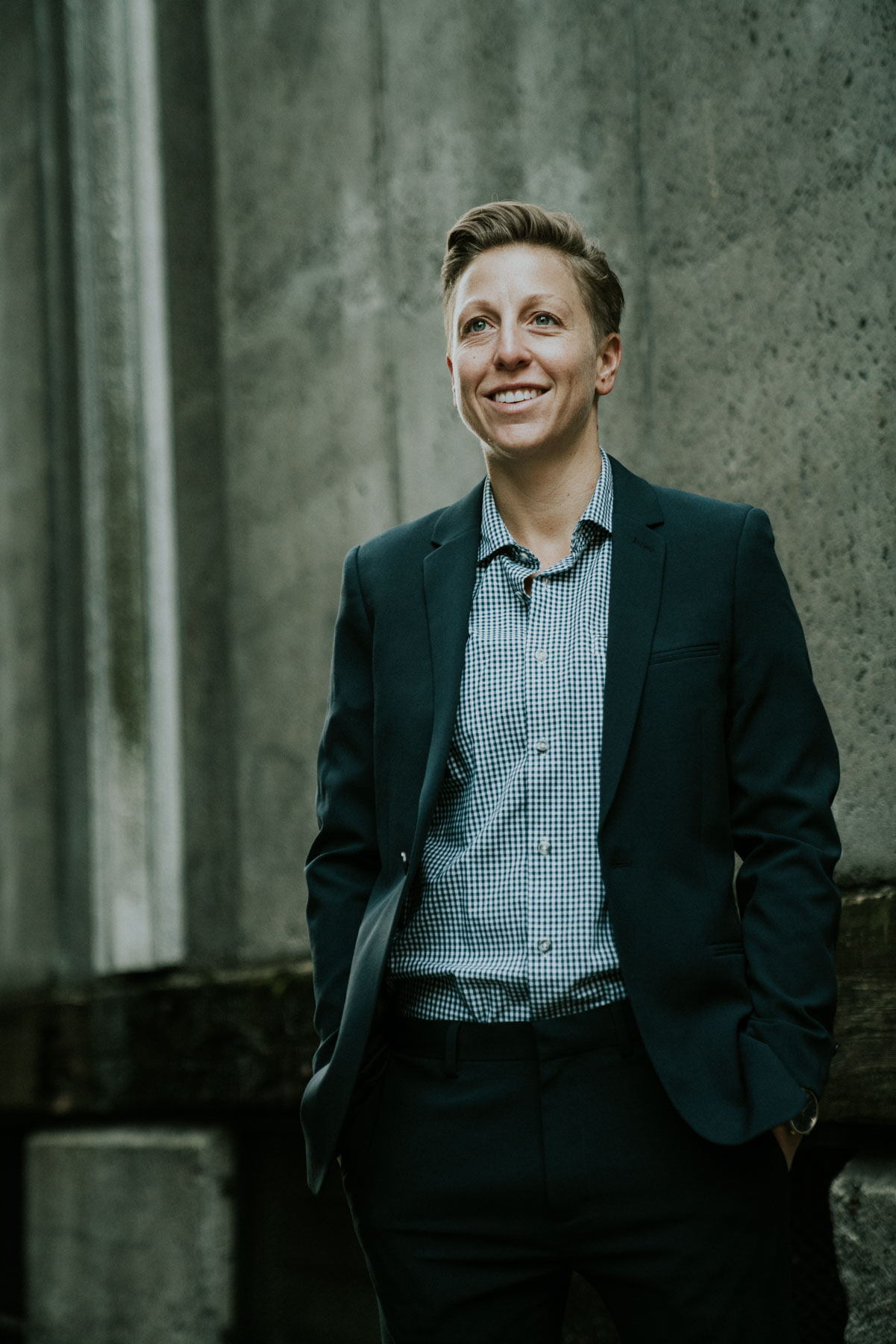
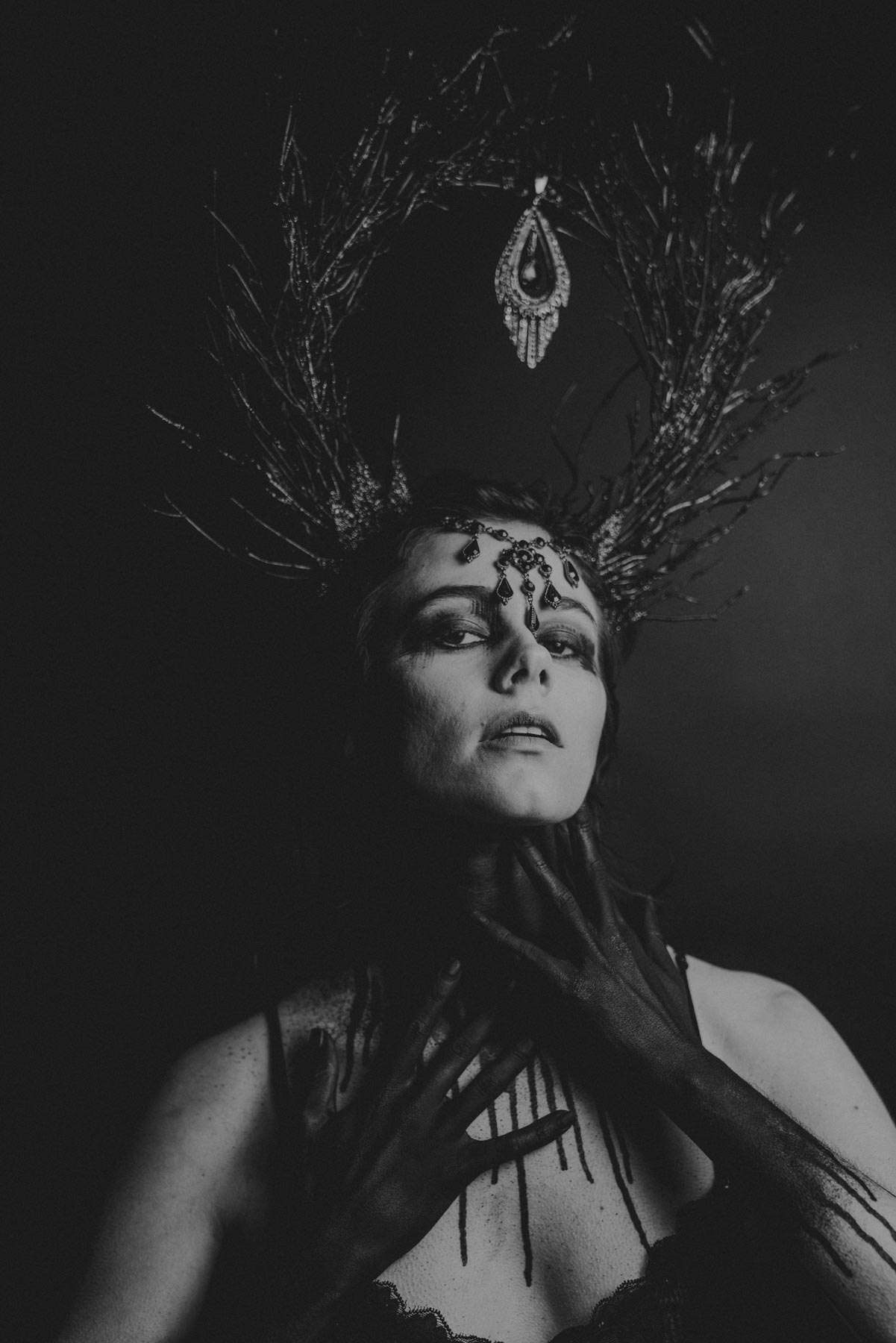
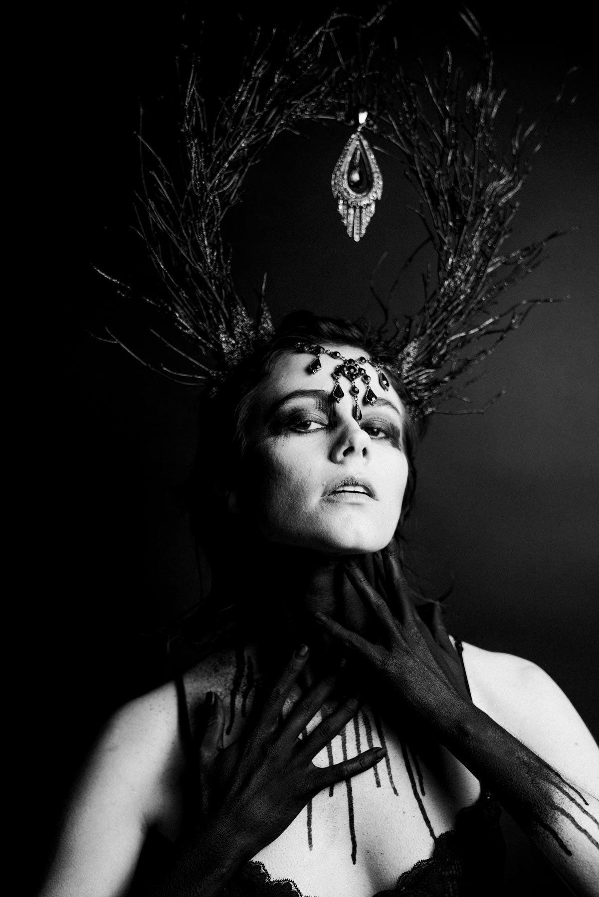
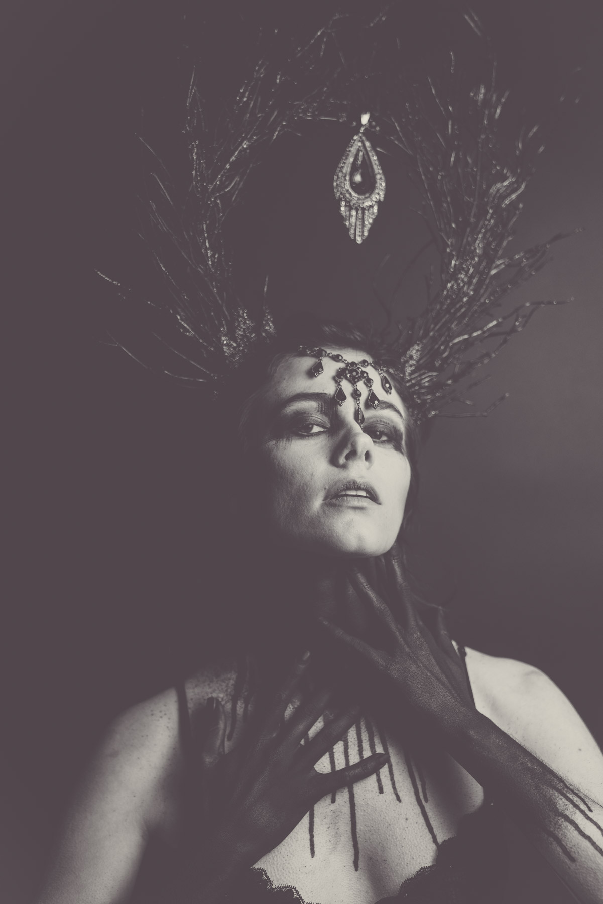
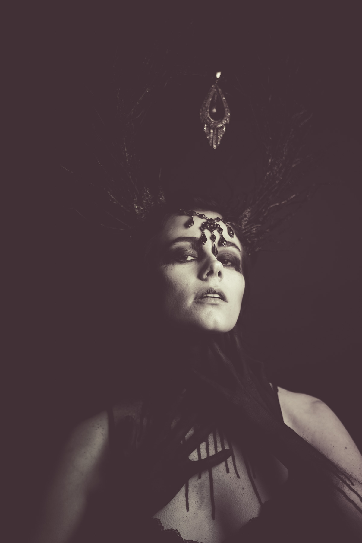
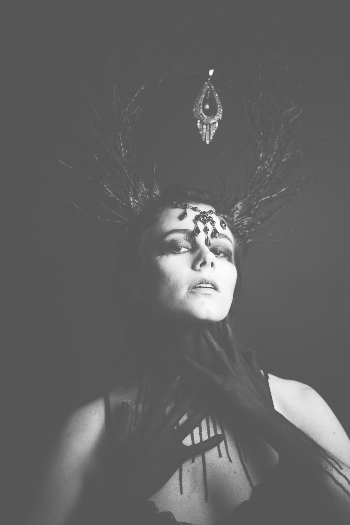
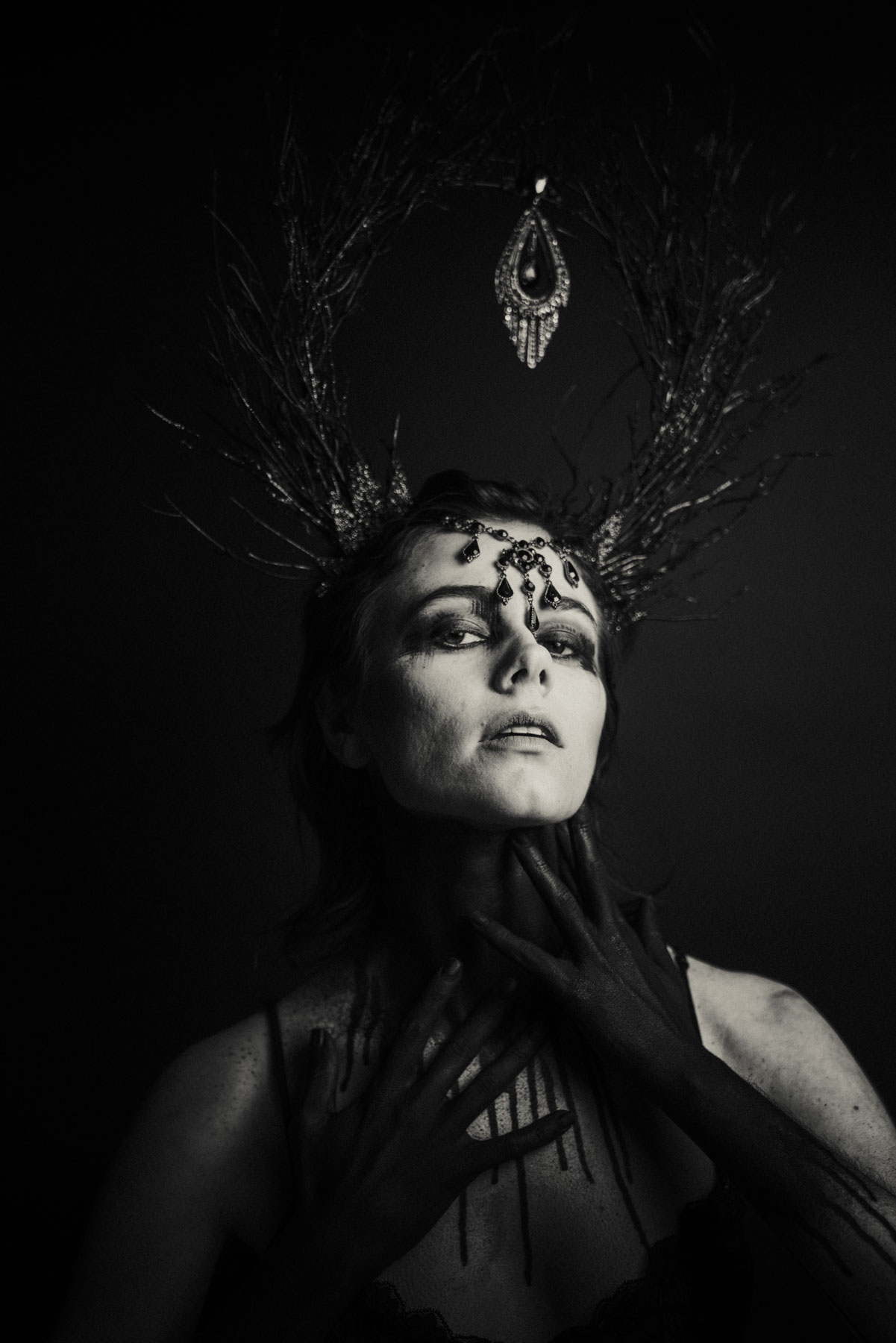
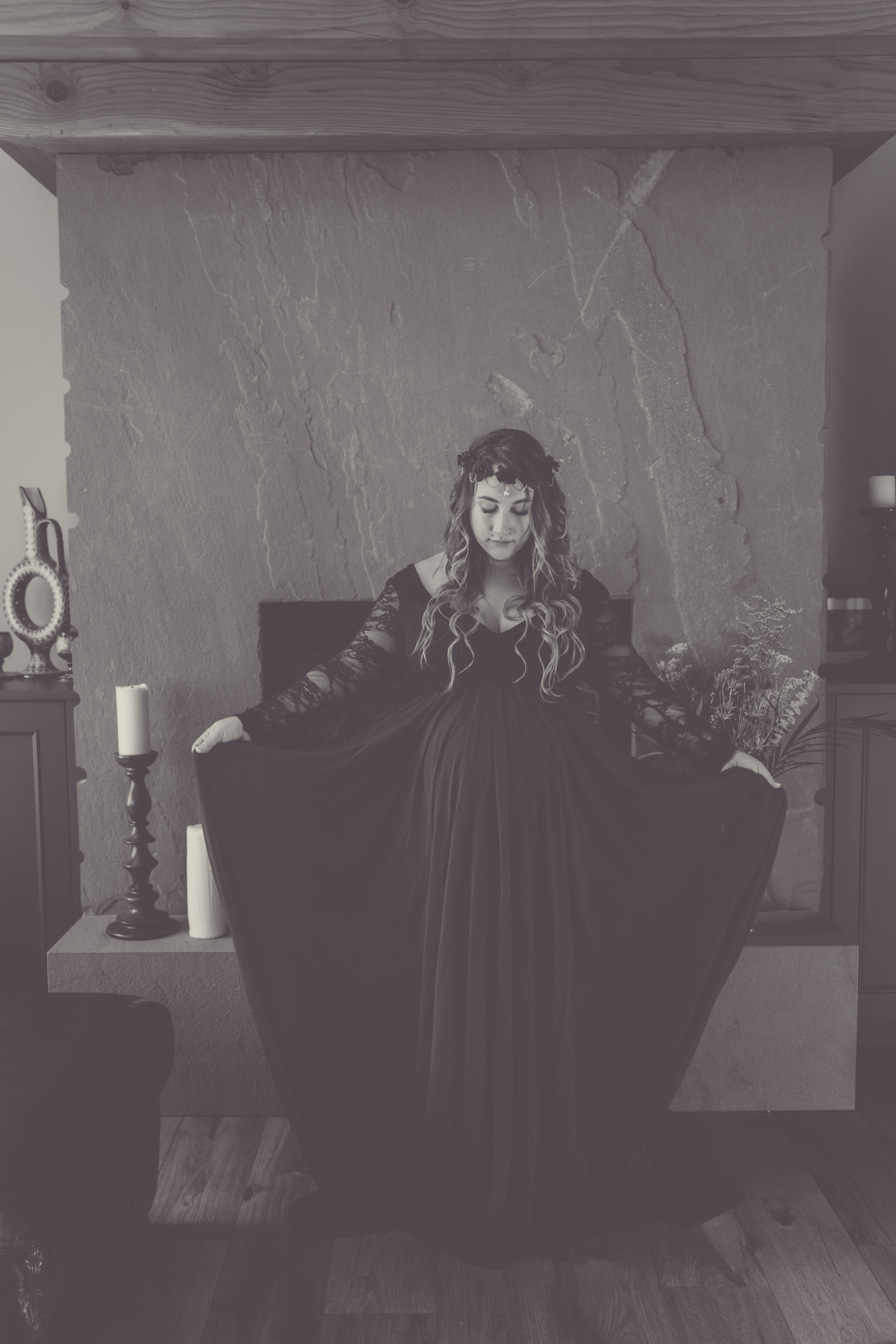
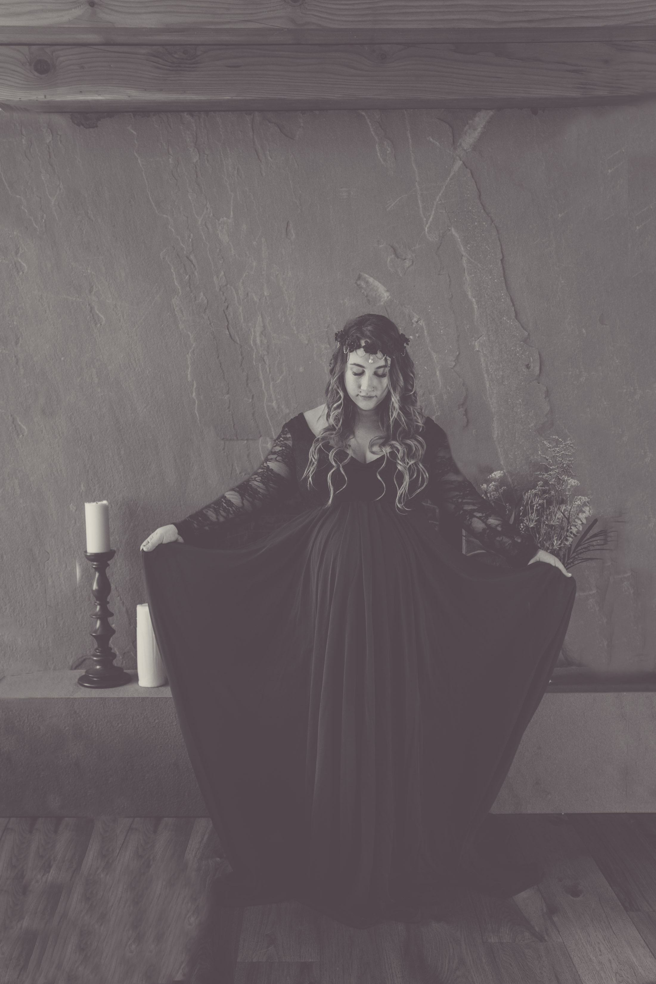
Some photos are better dark and moody. Lots of shadows and cool tones, these photos are usually more serious, editorial like. While the happy ones are brighter, more colourful. For example:
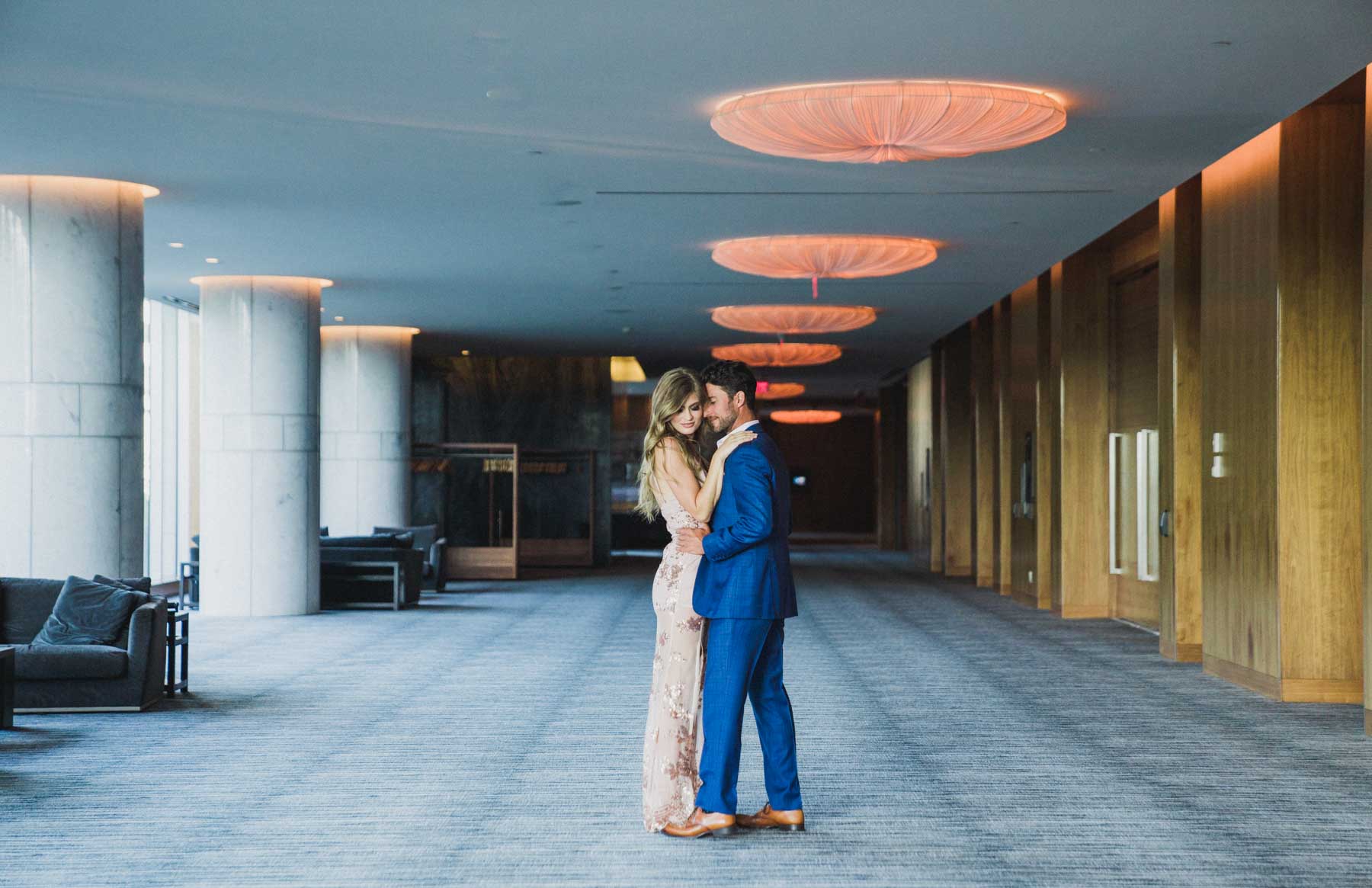
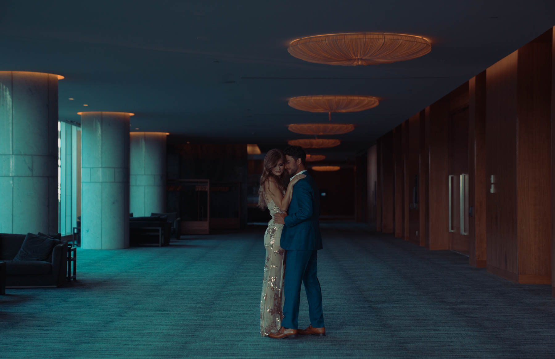
Making a photo warmer or colder
I’ve covered this under styles, sometimes a photo might be too cold, so I can increase the temperature to make it warmer. Here is an example of the same photo but one is warm and the other cold.
Sharpening or softening a photo.
Sharpening a photo increases the clarity. Meanwhile softening a photo makes it dream, hazy like. Almost like a painting. When you soften a photo, you also bring down the grain, and the skin becomes smooth. By sharpening a photo, you actually emphasize all those little imperfections, and adding more grain and texture.
Making a photo more or less colourful.
This is an easy one. Usually the warm and cold tones are pretty desaturated. So if you’re a lover of color, you may not want that style at all. And instead opt in for more vibrant, saturated colour. Or you might want the opposite, and have your photos more monotone.
Black & White to Colour and vice versa
This one is a pretty straight forward one, however they are so many options for black and white photos. You can have the original bnw, or it can a slight tint to it, usually a magenta or green. It can be a sepia bnw, that looks like a vintage and old photo. If you ask for a photo back in color, just don’t forget to mention what style you’d like it in, warm, colour, saturated etc.

Retouching
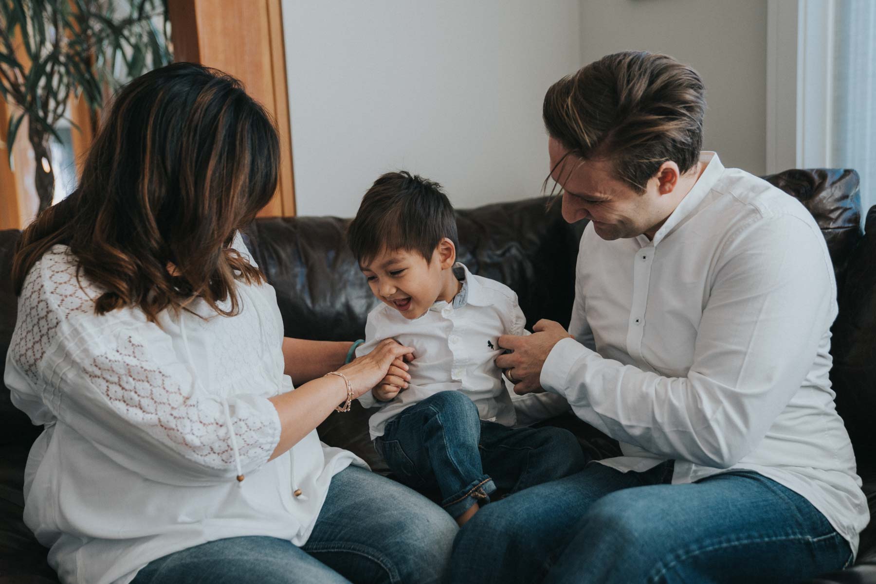
Now that we’ve covered color correction, let’s move to retouching. Retouching is very different from color correction. It involves photoshop and takes more time to do depending on the amount of retouching required. You can photoshop your skin to look smooth and remove any imperfections. You can alter & tuck in parts of your body. There is smoothing out the backdrop or removing unwanted furniture. You can even create whole composites. Adding things like snow, and props that weren’t even there.
Smoothing the skin
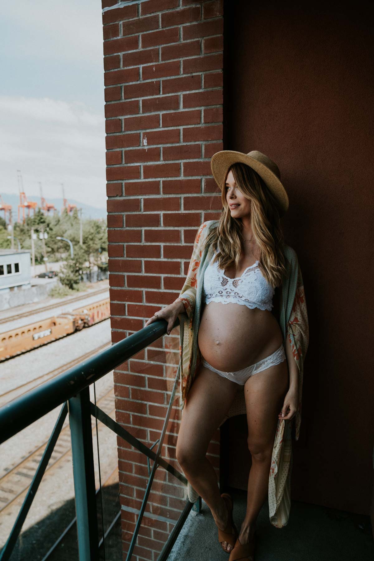
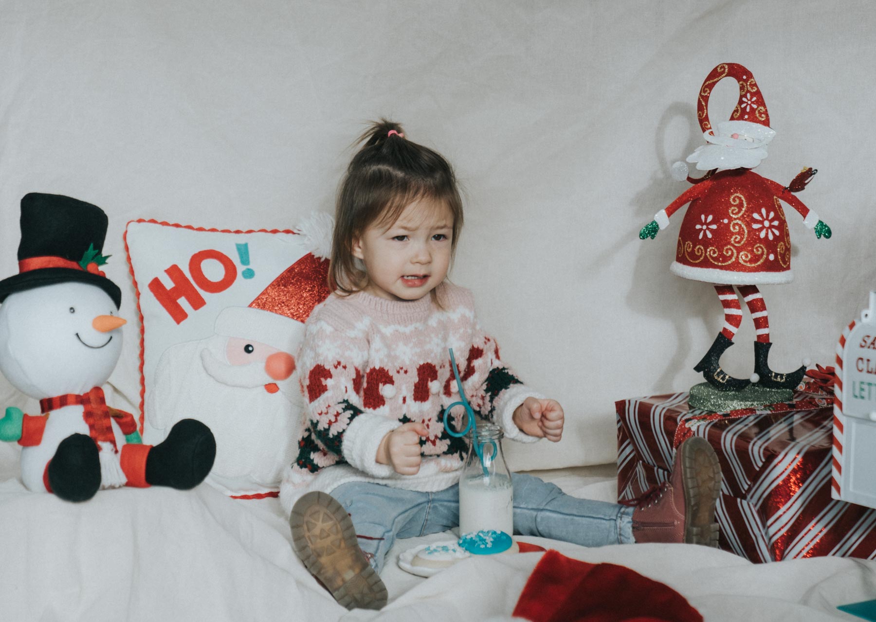
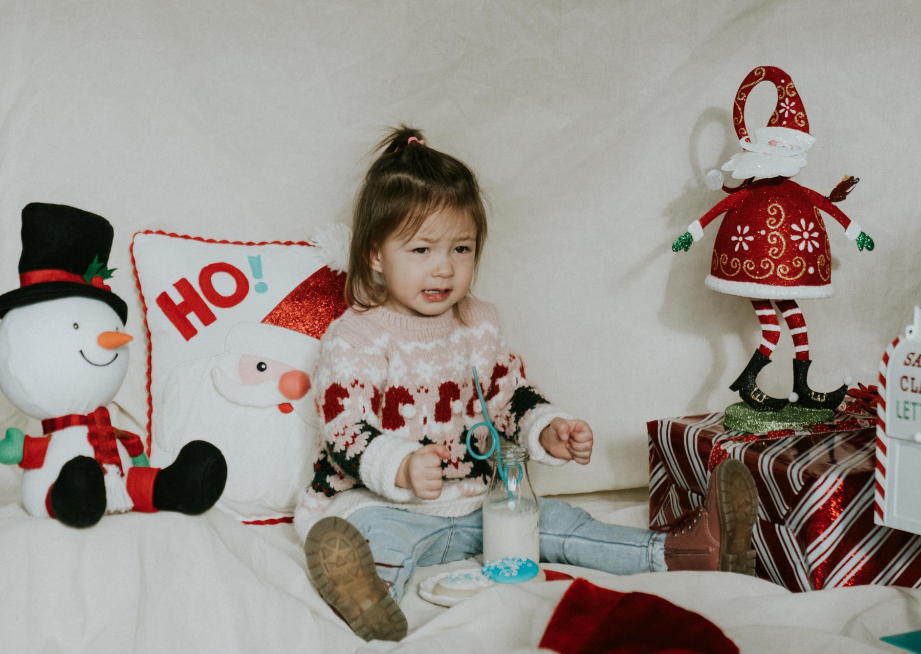
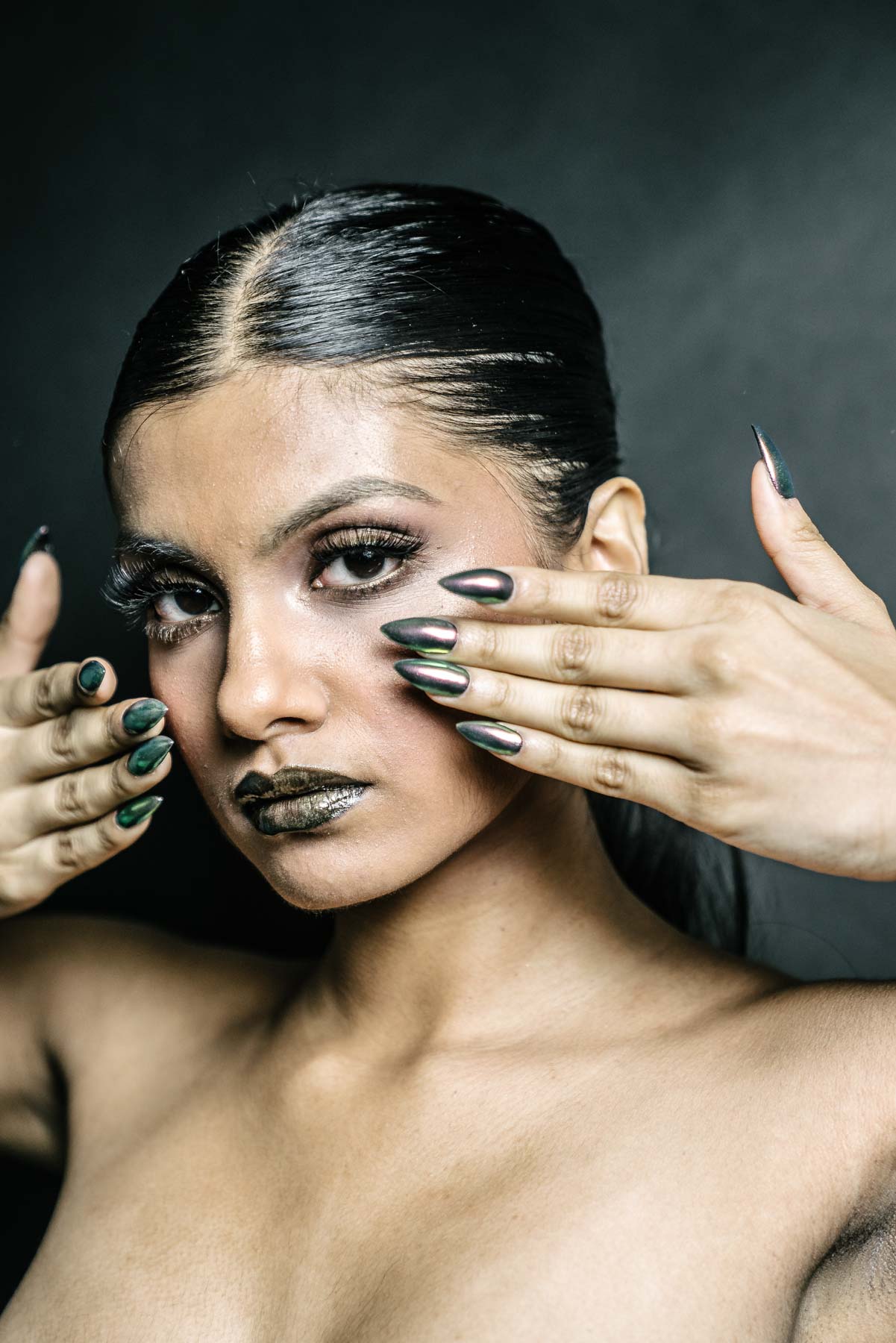
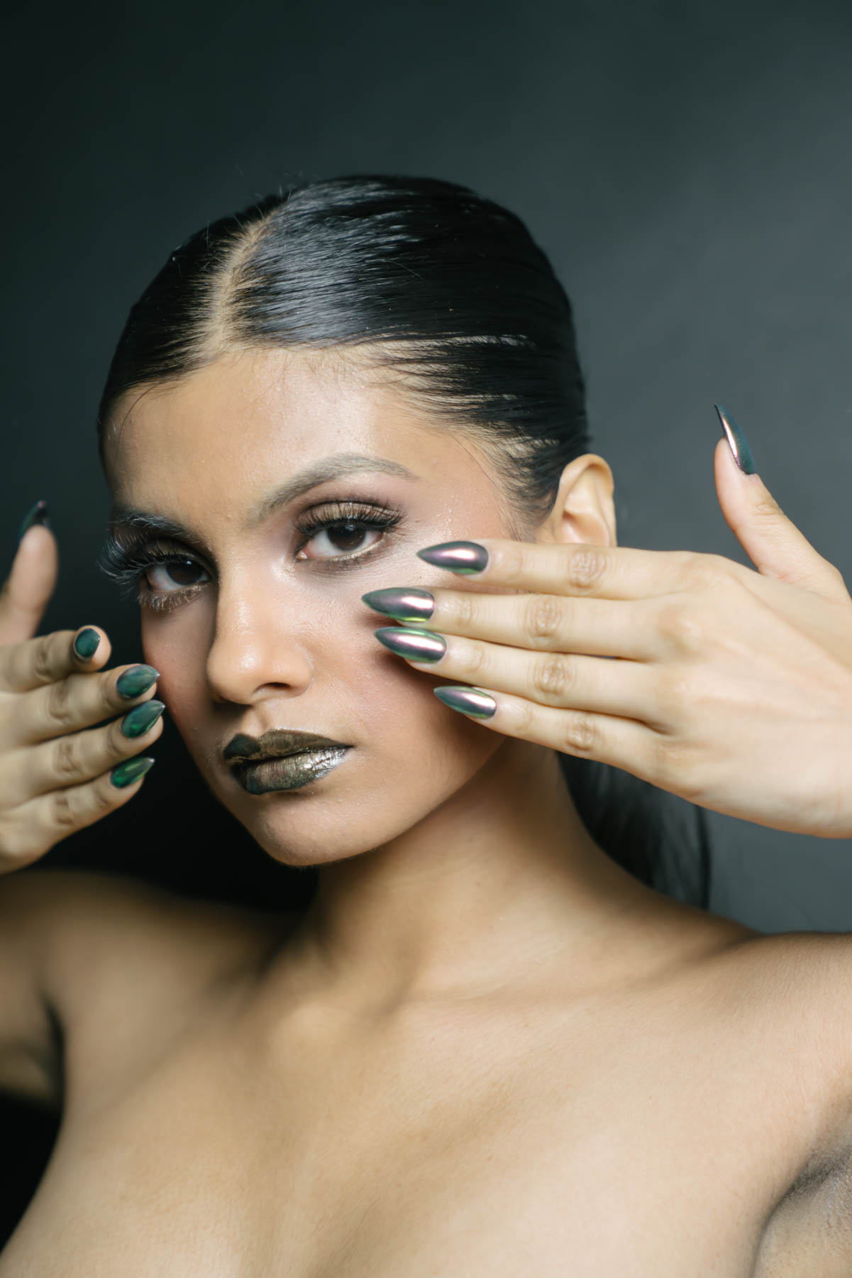
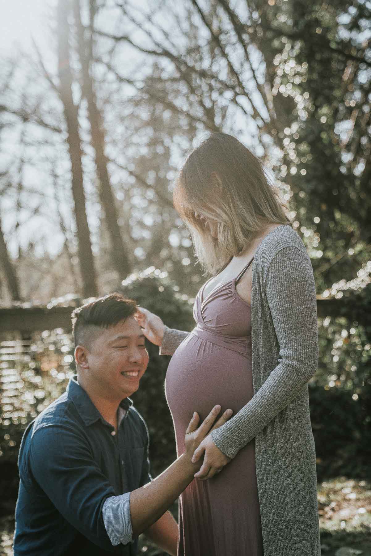
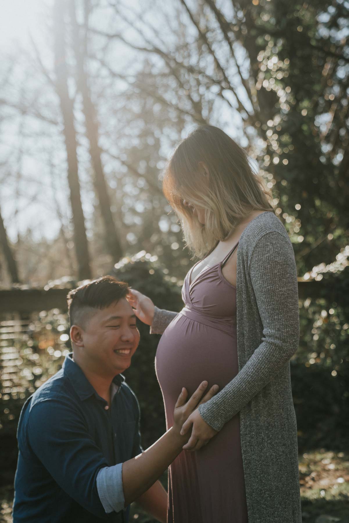
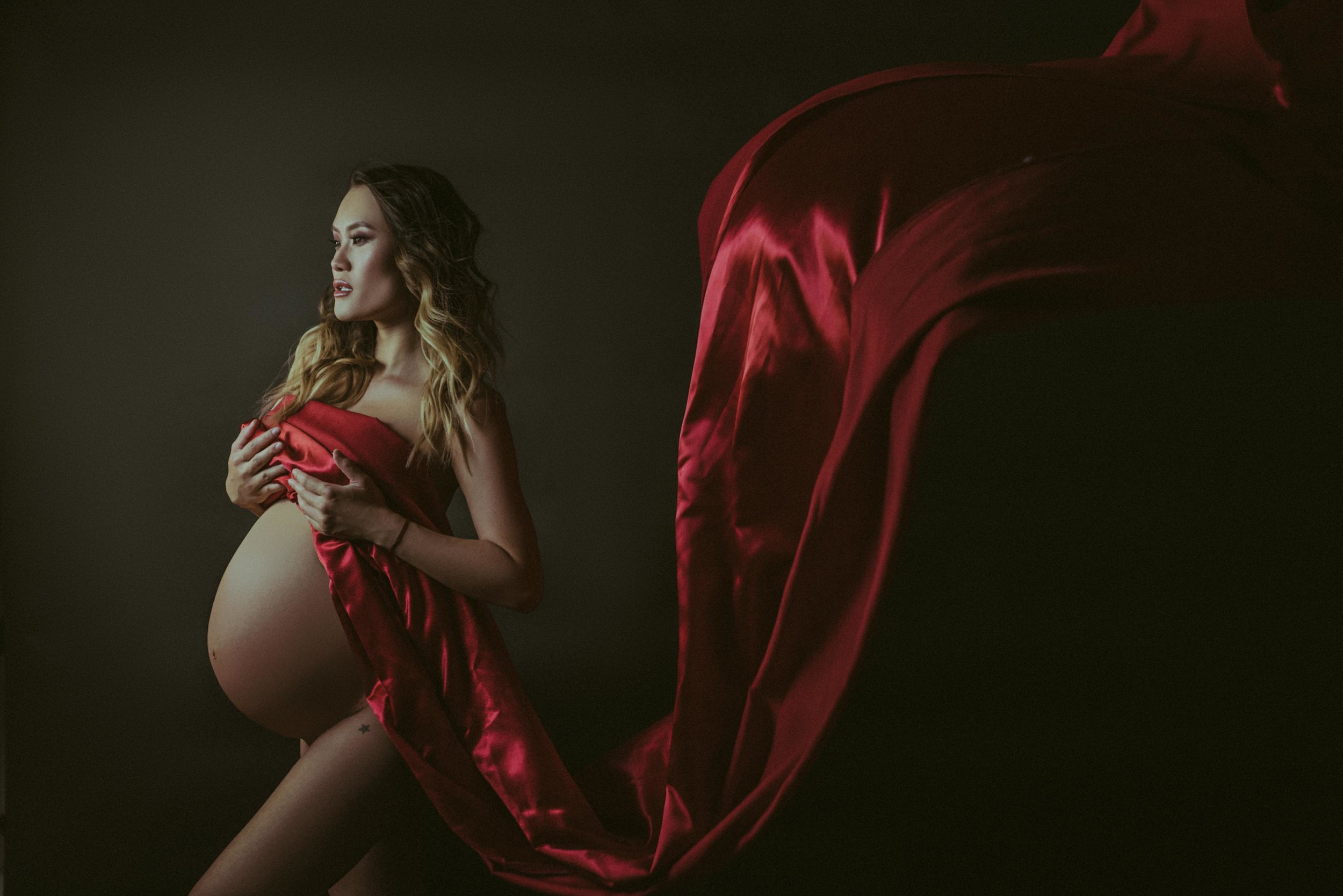
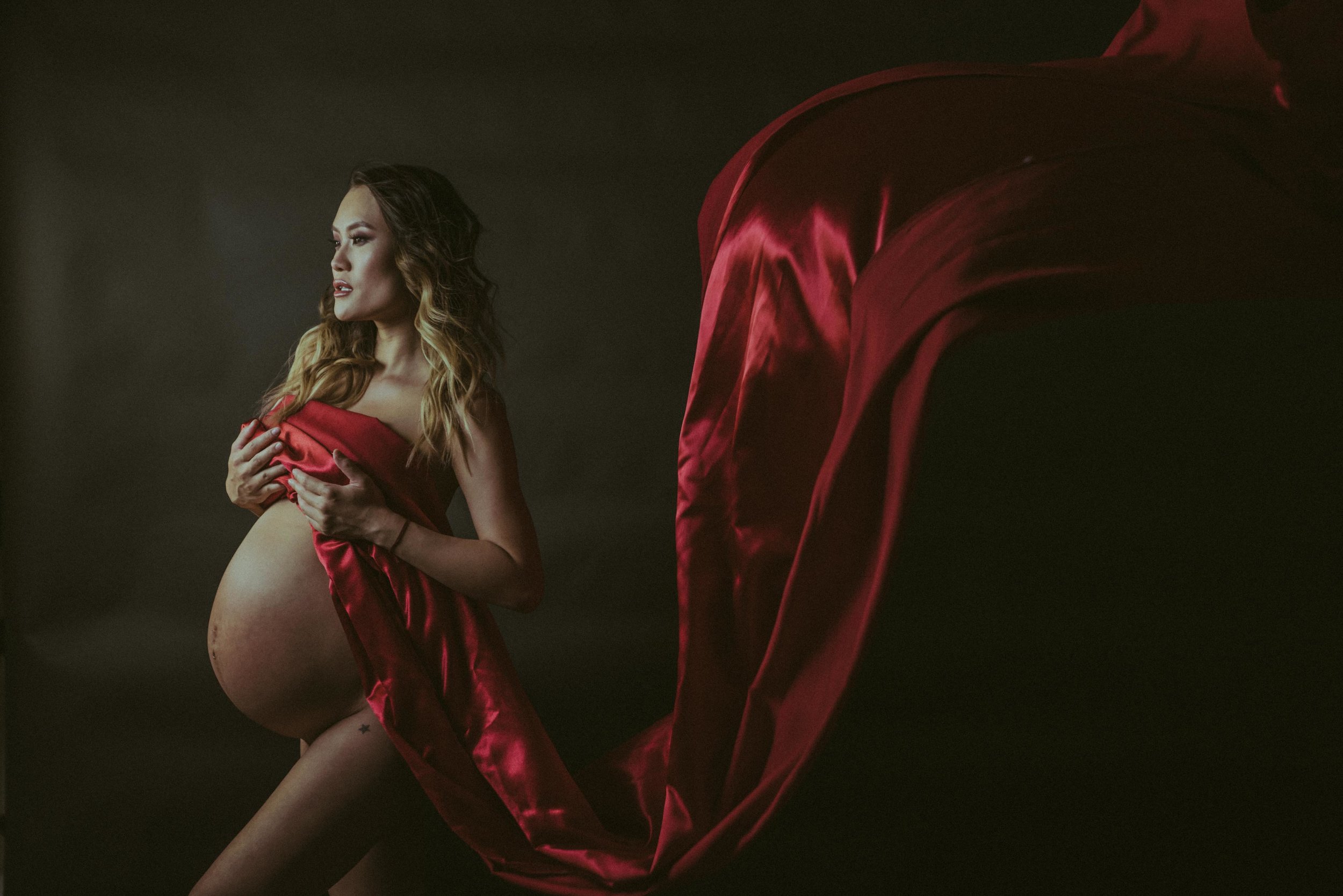
This is an easy one. Removing pimples, wrinkles, hairs, pores and smoothing out the skin altogether. And this is not just the face but also body. A lot of maternity photos need retouching, especially around the belly area because the belly color usually doesn’t match the rest of the body. Here’s some examples
Altering the body
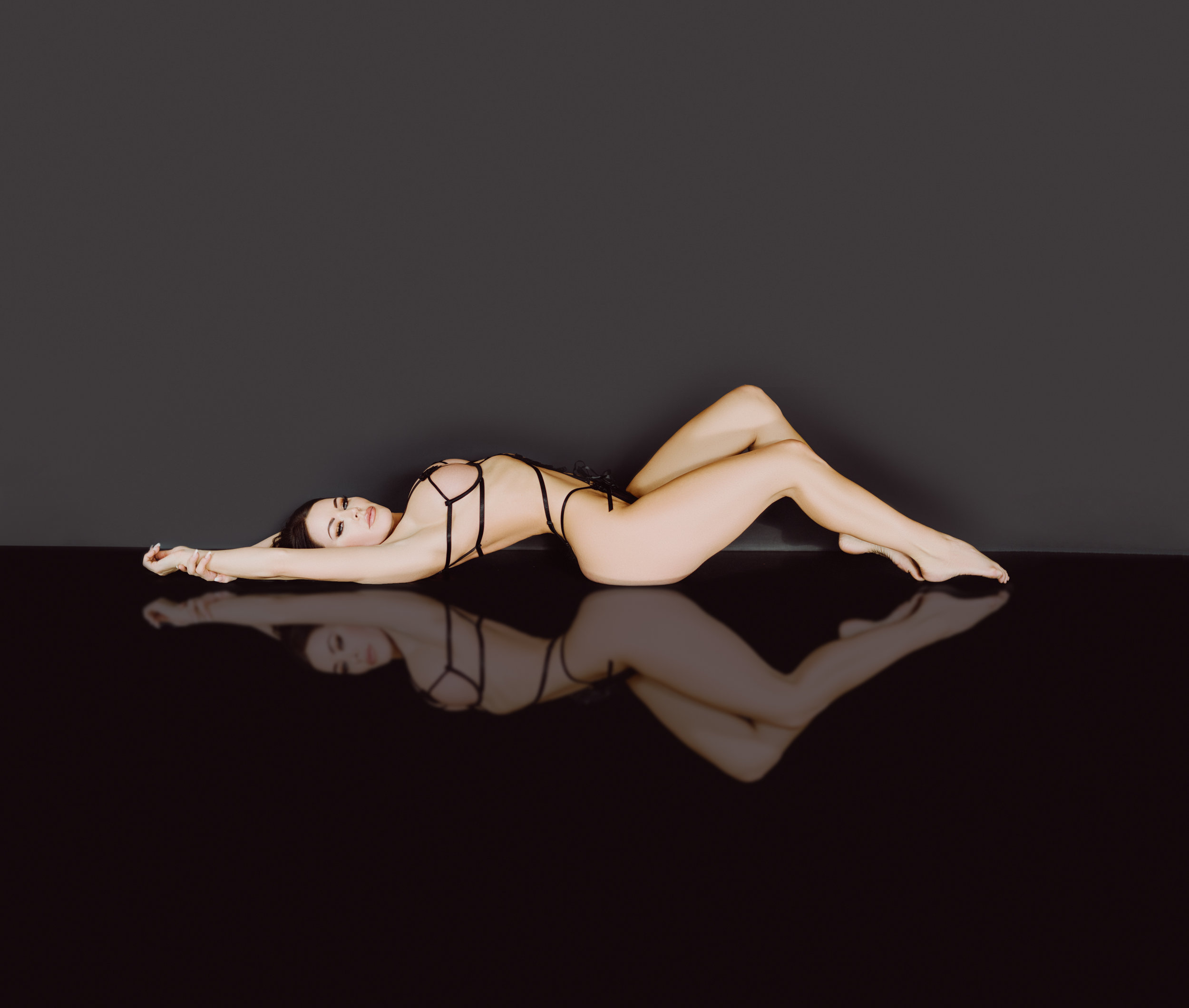
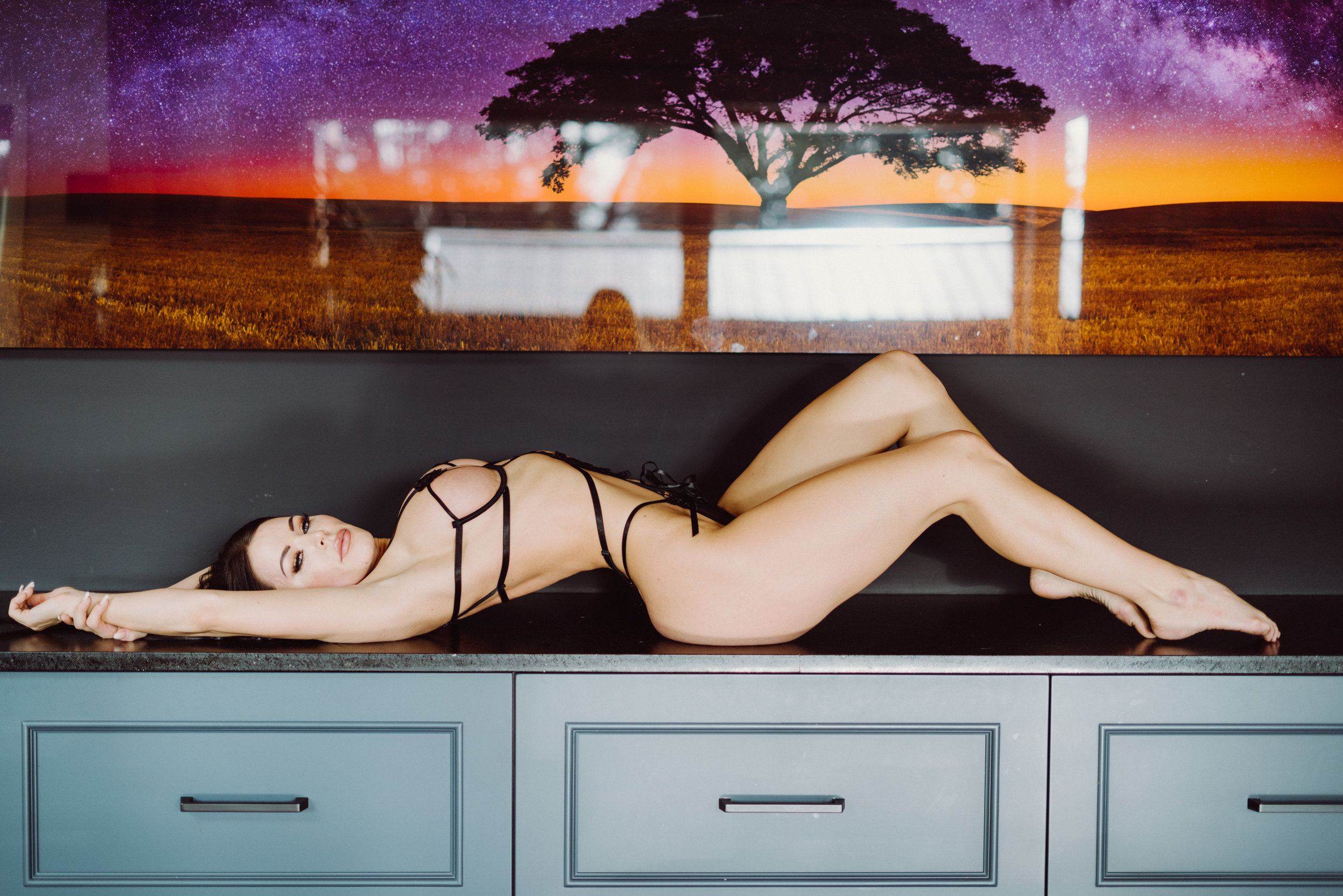
Sometimes you might love the photo and the composition, but there is just one thing that you want to adjust. For example tucking in belly fat, elongating the neck or torso., making your butt bigger (personal favourite). You get the idea, this is usually done for boudoir photos. I never overdo the altering, I don’t believe in altering a photo so much that you’re unrecognizable but I understand that these photos are for a lifetime and you want to feel as comfortable and beautiful as possible.
Removing furniture or props from the area.
A shot could be perfect but there might be something in the way. You can also make the backdrop bigger and the subject smaller. For example look at these photos:
At the end of the day, it is your personal preference on how you want your photos edited and what you want adjusted. A lot of my clients don’t really know what they want, so that’s why I like to give them a variety of edited photos from black and whites to warm and cold tones, and some colourful ones. Unless they tell me they like a specific style during our consultation.
I hope this article gives you a better idea of all the parts of the editing process. If you have questions, drop them below and I’d be happy to answer them!